
MaxGUI.MaxGUI
The MaxGUI module contains commands to create and control user interfaces for developing applications in BlitzMax.
Users should be familiar with the WaitEvent command and BlitzMax events which provide the basic communication mechanism between user interface and program when developing MaxGUI applications.
Gadgets
MaxGUI provides numerous types of gadgets that can be created and arranged for the purposes of providing a user interface to BlitzMax applications.The position of gadgets in relation to their group (parent) gadget can be controlled with the SetGadgetShape command and monitored with the GadgetX, GadgetY, GadgetWidth and GadgetHeight commands. Gadgets that can act as group gadgets (such as Windows, Tabbers and Panels) have an inner client region that contains their children, with an area that can be found using ClientWidth and ClientHeight.
Gadgets can be made to automatically reposition themselves when their group gadget changes size with the SetGadgetLayout command.
A gadget's group, or parent, gadget can be retrieved using the GadgetGroup command. A gadget can be shown with ShowGadget, hidden with HideGadget, its visibility found with the GadgetHidden function and removed completely from the system with the FreeGadget command. It is now also possible to determine a gadget's class/type using the GadgetClass command.
EnableGadget, DisableGadget and GadgetDisabled control and determine if a gadget is currently enabled.
ActivateGadget will set a particular gadget as active so that it is highlighted and receives any keyboard events while ActiveGadget returns which gadget (if any) is currently active.
SetGadgetText, SetGadgetFont, SetGadgetColor and SetGadgetTextColor change the appearance of many of the MaxGUI gadgets.
Those wanting to store their own object with gadget can do so using the SetGadgetExtra command - a reference to your object will be stored inside the TGadget type and is retrievable using the matching GadgetExtra command. The object reference will be overwritten by future calls to SetGadgetExtra or when FreeGadget is called.
Recently, SetGadgetTooltip and GadgetTooltip have been added to MaxGUI to allow tooltips to be set on standard non list-based gadgets, including Buttons, Labels, TextFields etc.
Tooltips are set on an item-by-item basis for gadgets such as ListBoxes and Tabbers etc. Attempting to set an overall gadget tooltip on a list-based gadget will have no effect.
Finally, a more generic SetGadgetPixmap command has been added which will eventually allow you to set pixmaps for many gadgets (not just for panels), depending on your platform.
Events
Gadgets that allow user-interaction emit events that can be caught and processed in your main application loop (typically with the WaitEvent command). The events a gadget can generate will be listed under the corresponding CreateGadget() documentation.It is important to note, however, that events are only emitted when the user interacts with, or changes the state, of a gadget. Any changes made to gadget through MaxGUI command calls (such as SelectGadgetItem) should not result in events being emitted.
Windows
A Window is used to contain a collection of gadgets that make up the user interface of an application. The CreateWindow command creates a window of a specified size that can then be used as the group parameter for the other gadget creation commands.
The WindowMenu command returns a handle that can be used as the parent parameter of the CreateMenu command to add menus to a window. UpdateWindowMenu should be called after adding/changing a window's menu for the changes to take effect. A window can be activated (bringing the window in front, with focus) with the ActivateWindow command. The text displayed in a window's optional status-bar can be set using the SetStatusText command.
If a window is created with the WINDOW_RESIZABLE style, its sizing can be restrained using SetMinWindowSize and SetMaxWindowSize and it can be minimized, maximized and restored with the MinimizeWindow, MaximizeWindow and RestoreWindow commands. The state of a window can be dermined using WindowMinimized and WindowMaximized.
Menus
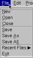
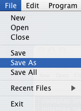
The CreateMenu command is used to create menu-items. Menus can be attached either to a window's menu-bar by parenting them to a WindowMenu or can popup at the current mouse location if used with the PopupWindowMenu command.
CheckMenu adds a tick next to a menu-item and UncheckMenu removes it. DisableGadget will "gray out" a menu item, preventing it from being chosen by the user. EnableGadget reverses this operation.
Buttons
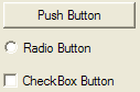
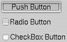
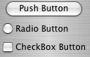
The CreateButton command is used to add buttons to a group gadget. Buttons can be standard push buttons that emit a single event whenever clicked, or they can be created with the BUTTON_CHECKBOX or BUTTON_RADIO styles in which case they can be toggled by the user (or programatically with the SetButtonState command). Their current state can be found with the help of the ButtonState function.
Panels


The CreatePanel command is used to to create a Panel gadget. Panels can be used to group other gadgets together and can be optionally assigned a background color or image using the SetPanelColor or SetPanelPixmap commands. They can be created with or without a border. Panels were one of the first gadgets that could emit mouse/key events by specifying the optional PANEL_ACTIVE style upon creation.
Text Fields
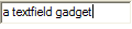
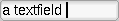
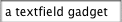
A text-field allows the users to enter a single line of text. A text-field's characters can be masked by specifying an optional TEXTFIELD_PASSWORD style flag upon the call to CreateTextField. This is useful for creating password-entry forms. As with all other gadgets, GadgetText and SetGadgetText can be used to set and retrieve the text in the field.
Text Areas
The CreateTextArea command creates a gadget for displaying formatted text, with optional TEXTAREA_WORDWRAP and TEXTAREA_READONLY styles.
The MaxGUI commands specific to text-areas are summarised below:
- SetTextAreaText and AddTextAreaText allow for convenient editing of the text.
- TextAreaText returns either a specified portion or the entire contents of a text-area.
- TextAreaLen returns the number of characters or lines currently contained.
- TextAreaCursor and TextAreaSelLen commands return the cursor position and selection length.
- SelectTextAreaText command provides a means to programatically select/highlight text.
- SetTextAreaFont and SetTextAreaColor affect the style and appearance of the text displayed in a Text Area.
- SetTextAreaTabs allows you to alter the position of tab stops.
- FormatTextAreaText allows sections of text to be formatted using their own colors and font styles.
- LockTextArea and UnlockTextArea commands should be used to improve performance when formatting lots of text.
- TextAreaChar and TextAreaLine commands convert between line and character positions.
- TextAreaCharX and TextAreaCharY find the x,y coordinates of a character position relative to the top-left corner of the gadget.
Combo Boxes
Combo-boxes provide a dropdown list of options to the user with an optional style that allows the user to enter their own text in a similar manner to the TextField gadget. CreateComboBox creates a ComboBox and the standard list based gadget commands ClearGadgetItems, AddGadgetItem, ModifyGadgetItem, RemoveGadgetItem, SelectGadgetItem, SelectedGadgetItem, CountGadgetItems and GadgetItemText can be used to manage the items contained by the ComboBox gadget.
List Boxes


List-boxes are similiar to ComboBoxes but features a scrolling list rather than a drop-down selection mechanism. The CreateListBox command is used to create a ListBox gadget while the standard list based gadget commands listed in the previous ComboBox section are used to manage the items.
Toolbars
Toolbars display a row of clickable icons at the top of a window. The CreateToolbar command creates a window toolbar using a previously loaded TIconStrip or using a specified image file containing a strip of icons.
EnableGadgetItem and DisableGadgetItem control the interactive state of individual items while SetToolbarTips assigns a list of meaningful strings to the toolbar items.
The recommended icon size for toolbars is 24x24 pixels which seems to work well on most platforms. Using a different image size may result in the pixmaps being scaled before being set depending on the OS.
It is important to note that Toolbars should only ever be added to Windows - adding ToolBars to other group gadgets may cause your program to crash on some platforms.
Tabbers
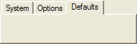
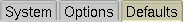
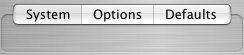
The CreateTabber command creates a tab control gadget commonly used to group gadgets into a collection of pages. The standard list based gadget commands ClearGadgetItems, AddGadgetItem, ModifyGadgetItem, RemoveGadgetItem, SelectGadgetItem, SelectedGadgetItem, CountGadgetItems and GadgetItemText can be used to manage the items contained in a Tabber gadget.
TreeViews
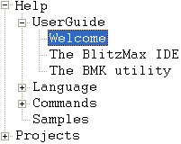
A TreeView is used to display hierarchical data where items are contained in nodes that can be children of other nodes. The CreateTreeView command creates a new TreeView gadget that provides a TreeViewRoot used to create a tree of nodes.
AddTreeViewNode, InsertTreeViewNode, ModifyTreeViewNode, ExpandTreeViewNode, CollapseTreeViewNode and FreeTreeViewNode provide commands to control the the contents of a TreeView.
SelectedTreeViewNode and SelectTreeViewNode return and set the currently highlighted node in a TreeView while CountTreeViewNodes returns the number of nodes contained in a single TreeViewNode. FreeTreeViewNode and ClearTreeView can be used to remove nodes previously added to a TreeView gadget.
HtmlViews
An HTMLView is a gadget containing a complete web browser display. The CreateHTMLView command creates an HTMLView gadget while HtmlViewGo, HtmlViewBack and HtmlViewForward control the page being displayed.
HtmlViewStatus and HtmlViewCurrentURL provide extended information about the state of an HTMLView gadget while HtmlViewRun allows scripts (i.e. javascript) to be run (on some platforms).
Labels
Labels are read-only regions of text on a user inteface that do not have a background and are created with the CreateLabel command.Sliders
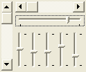
Sliders allow the user to control a numerical value by dragging a control inside a container. CreateSlider can create both a scroll-bar type slider (where the size of the knob represents the portion of the document being viewed) and trackbar style sliders (where the knob is a fixed size and SetSliderRange controls the minimum and maximum values allowed by the control).
SetSliderValue and SliderValue set and retrieve the position of a Slider control.
Progress Bars


CreateProgBar creates a progress bar gadget commonly used to display the progress of an operation. The UpdateProgBar command is used to update the progress bar with a floating point value between 0.0 and 1.0 and are typically used to represent how complete the current operation is.
Desktop
A gadget representing the user's desktop is returned by the Desktop command. The Desktop gadget is particularly useful for finding primary screen and workspace resolutions using GadgetWidth / GadgetHeight or ClientWidth / ClientHeight respectively.The LookupGuiFont and LookupGuiColor commands can be used to retrieve system defined font and color information.
Functions
Function SetHotKeyEvent:THotKey( key,mods,event:TEvent=Null,owner:Byte Ptr=0 )
Set a hotkey event.
When the specified hotkey combination is selected by the user, the specified event will be emitted using EmitEvent.
If event is Null, an event with an id equal to EVENT_HOTKEYHIT, data equal to key and mods equal to mods will be emitted.
SetHotKeyEvent will overwrite any existing hotkey event with the same key, mods and owner.
Please refer to the Key Codes module for valid key and modifier codes.
Function RemoveHotKey(hotkey:THotKey)
Remove a hotkey event.
Clears a hotkey object created with SetHotKeyEvent.
Function LookupGuiColor( colorindex, red:Byte Var, green:Byte Var, blue:Byte Var )
Look-up a system defined color.
colorindex can be one of the following values:
| Constant | Description | Fall Back |
| GUICOLOR_WINDOWBG | Window/panel background color. | R: 240, G: 240, B: 240 |
| GUICOLOR_GADGETBG | Gadget background color (e.g. textfield). | R: 255, G: 255, B: 255 |
| GUICOLOR_GADGETFG | Gadget text color. | R: 0, G: 0, B: 0 |
| GUICOLOR_SELECTIONBG | Text selection background color. | R: 50, G: 150, B: 255 |
| GUICOLOR_LINKFG | Hyperlink text color. | R: 0, G: 0, B: 255 |
See Also: LookupGuiFont, RequestColor
Returns
True if a matching color is retrieved from the system, False if the hard-coded fall-back is used.
Example
' lookupguicolor.bmx

Strict

Import MaxGUI.Drivers

AppTitle = "LookupGuiColor() Example"

Global wndMain:TGadget = CreateWindow( AppTitle, 100, 100, 300, 200, Null, WINDOW_TITLEBAR|WINDOW_STATUS )

    Global pnlMain:TGadget = CreatePanel( 0, 0, ClientWidth(wndMain), ClientHeight(wndMain), wndMain )

        Global cmbColors:TGadget = CreateComboBox( 5, 5, ClientWidth(wndMain) - 10, 28, pnlMain )

        ' Populate combo-box with the available color constants

        AddGadgetItem cmbColors, "GUICOLOR_WINDOWBG", GADGETITEM_DEFAULT, GUICOLOR_WINDOWBG
        AddGadgetItem cmbColors, "GUICOLOR_GADGETBG", 0, GUICOLOR_GADGETBG
        AddGadgetItem cmbColors, "GUICOLOR_GADGETFG", 0, GUICOLOR_GADGETFG
        AddGadgetItem cmbColors, "GUICOLOR_SELECTIONBG", 0, GUICOLOR_SELECTIONBG
        AddGadgetItem cmbColors, "GUICOLOR_LINKFG", 0, GUICOLOR_LINKFG

ActivateGadget cmbColors

Repeat
    Select WaitEvent()

        Case EVENT_APPTERMINATE, EVENT_WINDOWCLOSE
            End

        Case EVENT_GADGETACTION
            Local red:Byte, green:Byte, blue:Byte
            LookupGuiColor( GadgetItemIcon( cmbColors, EventData() ), red, green, blue )
            SetGadgetColor( pnlMain, red, green, blue )
            SetStatusText( wndMain, "RGB( " + red + ", " + green + ", " + blue + " )" )

    EndSelect
Forever
Function RequestColor(r,g,b)
Prompts the user for a color.
The parameters red, green, blue are the initial color to display in the requester, with components in the range 0 to 255.
After a color is selected, use the RequestedRed, RequestedGreen and RequestedBlue functions to determine the color chosen by the user.
See Also: LookupGuiColor
Returns
True if a color is selected, False if the requester was cancelled.
Example
' requestcolor.bmx

Import MaxGui.Drivers

Strict

Local window:TGadget
Local panel:TGadget
Local red,green,blue

window=CreateWindow("RequestColor",40,40,320,240)
panel=CreatePanel(20,20,32,32,window,PANEL_ACTIVE|PANEL_SUNKEN)

While True
    WaitEvent
    Select EventID()
        Case EVENT_WINDOWCLOSE
            End
        Case EVENT_MOUSEDOWN
            If RequestColor(red,green,blue)
                red=RequestedRed()
                green=RequestedGreen()
                blue=RequestedBlue()
                SetPanelColor panel,red,green,blue
            EndIf
    End Select
Wend
Function RequestedRed()
Get the red component of the color previously chosen by the user.
See RequestColor for more information.
Function RequestedGreen()
Get the green component of the color previously chosen by the user.
See RequestColor for more information.
Function RequestedBlue()
Get the blue component of the color previously chosen by the user.
See RequestColor for more information.
Function RequestFont:TGuiFont(font:TGuiFont=Null)
Prompts the user to select a system font.
Prompts the user for a font and returns an object that can then be used with the SetGadgetFont command.
See Also: LoadGuiFont, LookupGuiFont, FontName, FontSize and FontStyle
Returns
A TGuiFont object, or Null if no font was selected.
Example
' requestfont.bmx

Import MaxGui.Drivers

Strict

AppTitle = "RequestFont() Example"

Const teststring:String = "The quick brown fox jumps over the lazy dog."

Local window:TGadget = CreateWindow(AppTitle,50,50,300,200,Null,WINDOW_TITLEBAR|WINDOW_STATUS|WINDOW_RESIZABLE)
    SetMinWindowSize window, GadgetWidth(window), GadgetHeight(window)

    Local label:TGadget = CreateLabel(teststring,0,0,ClientWidth(window),ClientHeight(window)-26,window)
        SetGadgetLayout label, EDGE_ALIGNED, EDGE_ALIGNED, EDGE_ALIGNED, EDGE_CENTERED

    Local button:TGadget = CreateButton("Select Font",0,ClientHeight(window)-26,ClientWidth(window),26,window)
        SetGadgetLayout button, EDGE_ALIGNED, EDGE_ALIGNED, EDGE_CENTERED, EDGE_ALIGNED

Local font:TGUIFont

Repeat
    Select WaitEvent()
        Case EVENT_WINDOWCLOSE, EVENT_APPTERMINATE
            End
        Case EVENT_GADGETACTION
            font = RequestFont(font)
            If font Then
                SetGadgetFont label, font
                SetStatusText window,FontName(font) + ": " + Int(FontSize(font)+0.5) + "pt"
            EndIf
    End Select
Forever
Function LoadGuiFont:TGuiFont(name$,height:Double,bold=False,italic=False,underline=False,strikethrough=False)
Load a system font by name.
Loads a system font by name and returns an object that can then be used with the SetGadgetFont command.
Depending on the platform, some gadgets may not respond to all or any of the attributes specified in the function parameters.
See Also: RequestFont, LookupGuiFont, FontName, FontSize and FontStyle
Returns
A TGuiFont object, or Null if a suitable matching font was not found on the system.
Function LookupGuiFont:TGuiFont( pFontType% = GUIFONT_SYSTEM, pFontSize:Double = 0, pFontStyle% = 0 )
Loads a suitable GUI font that best matches the supplied font characteristics.
If the current MaxGUI driver doesn't return a suitable GUI font, then a hard-coded fall-back font is returned instead, depending upon the platform.
pFontType can take one of the following constants:
| Constant | Windows Fall-Back | Mac OS X Fall-Back | Linux Fall-Back | Description |
| GUIFONT_SYSTEM | MS Shell Dlg | Lucida Grande | FreeSerif | Default font used to draw gadgets by the OS. |
| GUIFONT_SERIF | Times New Roman | Times New Roman | FreeSerif | Serif font. |
| GUIFONT_SANSSERIF | Arial | Helvetica | FreeSans | Sans Serif font. |
| GUIFONT_SCRIPT | Comic Sans MS | Comic Sans MS | TSCu_Comic | Handwriting style font. |
| GUIFONT_MONOSPACED | Consolas/Courier New | Courier | Courier | Fixed width font typically used for coding. |
pFontSize specifies the point size the font should be loaded with. If this value is less than or equal to 0, then a suitable size is automatically chosen, or a hard-coded alternative is used (usually between 8-13pt).
pFontStyle should specify any additional font styles that the font should be loaded with. A combination of any of the following flags can be used:
| Constant | Font Style |
| FONT_BOLD | Bold |
| FONT_ITALIC | Italic |
| FONT_UNDERLINE | Underlined |
| FONT_STRIKETHROUGH | *Strikethrough |
Note: FONT_STRIKETHROUGH isn't fully supported by all gadgets/platforms.
See Also: LookupGuiColor, RequestFont, FontName, FontSize and FontStyle
Returns
A new TGuiFont instance chosen using the supplied parameters.
Example
' lookupguifont.bmx

Strict

Import MaxGUI.Drivers

AppTitle = "LookupGuiFont() Example"

Const strSampleText$ = "Lorem ipsum dolor sit amet, consectetuer adipiscing elit. Nulla eget mauris quis dolor "+..
"ullamcorper dapibus. Duis facilisis ullamcorper metus. Pellentesque eget enim. Vivamus auctor hendrerit turpis. " + ..
"Vestibulum ante ipsum primis in faucibus orci luctus et ultrices posuere cubilia Curae; Vivamus tincidunt leo quis urna."

Const intWindowFlags% = WINDOW_TITLEBAR|WINDOW_RESIZABLE|WINDOW_STATUS|WINDOW_CLIENTCOORDS

Global wndMain:TGadget = CreateWindow( AppTitle, 100, 100, 500, 300, Null, intWindowFlags )
    SetMinWindowSize( wndMain, ClientWidth(wndMain), ClientHeight(wndMain) )
Global lstFontTypes:TGadget = CreateListBox(0,0,200,ClientHeight(wndMain),wndMain)
    SetGadgetLayout lstFontTypes,EDGE_ALIGNED,EDGE_CENTERED,EDGE_ALIGNED,EDGE_ALIGNED
    AddGadgetItem lstFontTypes, "GUIFONT_SYSTEM", GADGETITEM_DEFAULT, -1, "Default OS font.", LookupGuiFont(GUIFONT_SYSTEM)
    AddGadgetItem lstFontTypes, "GUIFONT_SERIF", 0, -1, "Serif font.", LookupGuiFont(GUIFONT_SERIF)
    AddGadgetItem lstFontTypes, "GUIFONT_SANSSERIF", 0, -1, "Sans serif font.", LookupGuiFont(GUIFONT_SANSSERIF)
    AddGadgetItem lstFontTypes, "GUIFONT_SCRIPT", 0, -1, "Script/handwriting font.", LookupGuiFont(GUIFONT_SCRIPT)
    AddGadgetItem lstFontTypes, "GUIFONT_MONOSPACED", 0, -1, "Fixed width/coding font.", LookupGuiFont(GUIFONT_MONOSPACED)

Global txtPreview:TGadget = CreateTextArea(200,0,300,ClientHeight(wndMain),wndMain,TEXTAREA_WORDWRAP|TEXTAREA_READONLY)
    SetGadgetLayout txtPreview,EDGE_ALIGNED,EDGE_ALIGNED,EDGE_ALIGNED,EDGE_ALIGNED
    SetTextAreaText( txtPreview, strSampleText )

Global strFontString$

ChooseFont( LookupGuiFont() )

Repeat
    Select WaitEvent()
        Case EVENT_APPTERMINATE, EVENT_WINDOWCLOSE;End
        Case EVENT_GADGETACTION, EVENT_GADGETSELECT
            Select EventSource()
                Case lstFontTypes
                    If EventData() >= 0 Then
                        ChooseFont( TGuiFont(GadgetItemExtra( lstFontTypes, EventData() )) )
                    EndIf
            EndSelect
    EndSelect
    SetStatusText( wndMain, strFontString + "~t~t" + CurrentEvent.ToString() + "   " )
Forever

Function ChooseFont( pFont:TGuiFont )
    SetGadgetFont( txtPreview, pFont )
    strFontString$ = FontName(pFont) + ", " + Int(FontSize(pFont)) + "pt"
EndFunction
Function FontName$(font:TGuiFont)
Retrieves the corresponding property from the TGuiFont type instance.
See Also: LoadGuiFont, LookupGuiFont, RequestFont, FontSize and FontStyle
Returns
A string representing the name of the font.
Function FontSize:Double(font:TGuiFont)
Retrieves the corresponding property from the TGuiFont type instance.
See Also: LoadGuiFont, LookupGuiFont, RequestFont, FontName and FontStyle
Returns
A double representing the size (in points) of the font.
Function FontStyle(font:TGuiFont)
Retrieves the corresponding property from the TGuiFont type instance.
The returned value will be a combination of the following bit flags:
| Constant | Font Style |
| FONT_BOLD | Bold |
| FONT_ITALIC | Italic |
| FONT_UNDERLINE | Underlined |
| FONT_STRIKETHROUGH | *Strikethrough |
Note: FONT_STRIKETHROUGH isn't fully supported by all gadgets/platforms.
See Also: LoadGuiFont, RequestFont, FontName and FontSize
Returns
An integer representing the style of the font (e.g. Bold, Underlined, Italics, Strikethrough).
Function SetPointer(shape)
Changes the applcation's mouse cursor.
The shape of the system mouse pointer can be one of the following:
| Constant | Description |
| POINTER_DEFAULT | Default OS pointer. |
| POINTER_ARROW | Arrow pointer. |
| POINTER_IBEAM | Typically used when making text selections. |
| POINTER_WAIT | Hourglass animation. |
| POINTER_CROSS | Typically used for precise drawing. |
| POINTER_UPARROW | Typically used for selections. |
| POINTER_SIZENWSE | Typically used over sizing handles. |
| POINTER_SIZENESW | Typically used over sizing handles. |
| POINTER_SIZEWE | Typically used over sizing handles. |
| POINTER_SIZENS | Typically used over sizing handles. |
| POINTER_SIZEALL | Typically shown when moving an item. |
| POINTER_NO | Typically shown when an action is prohibited. |
| POINTER_HAND | Typically used for links. |
| POINTER_APPSTARTING | Usually shows a pointer and miniature hourglass animation. |
| POINTER_HELP | Usually shows an arrow pointer, with an adjacent question mark. |
Note: Some pointers may not be supported on all platforms.
Example
' setpointer.bmx

Import MaxGui.Drivers

Strict

Local window:TGadget
Local combo:TGadget

window=CreateWindow("SetPointer",40,40,320,240,,WINDOW_TITLEBAR)

CreateLabel "Select a pointer shape:",10,10,200,20,window

combo=CreateComboBox(10,30,200,24,window)
AddGadgetItem combo,"POINTER_DEFAULT"
AddGadgetItem combo,"POINTER_ARROW"
AddGadgetItem combo,"POINTER_IBEAM"
AddGadgetItem combo,"POINTER_WAIT"
AddGadgetItem combo,"POINTER_CROSS"
AddGadgetItem combo,"POINTER_UPARROW"
AddGadgetItem combo,"POINTER_SIZENWSE"
AddGadgetItem combo,"POINTER_SIZENESW"
AddGadgetItem combo,"POINTER_SIZEWE"
AddGadgetItem combo,"POINTER_SIZENS"
AddGadgetItem combo,"POINTER_SIZEALL"
AddGadgetItem combo,"POINTER_NO"
AddGadgetItem combo,"POINTER_HAND"
AddGadgetItem combo,"POINTER_APPSTARTING"
AddGadgetItem combo,"POINTER_HELP"

SelectGadgetItem combo,0

While True
    WaitEvent
    Select EventID()
        Case EVENT_WINDOWCLOSE
            End
        Case EVENT_GADGETACTION
            SetPointer EventData()
    End Select
Wend
Function FreeGadget( gadget:TGadget )
Remove a gadget and free its resources.
Function ClientWidth( gadget:TGadget )
Client area dimensions of a gadget.
Returns
The width of the client area (in pixels) of the specified container gadget.
Function ClientHeight( gadget:TGadget )
Client area dimensions of a gadget.
Returns
The height of the client area (in pixels) of the specified container gadget.
Function GadgetX( gadget:TGadget )
Horizontal position of gadget.
Returns
The horizontal position (in pixels) of a gadget relative to the top-left corner of the parent's client area.
Function GadgetY( gadget:TGadget )
Vertical position of gadget.
Returns
The vertical position (in pixels) of a gadget relative to the top-left corner of the parent's client area.
Function GadgetWidth( gadget:TGadget )
Gadget width.
Returns
The current width (in pixels) of a gadget.
Function GadgetHeight( gadget:TGadget )
Gadget height.
Returns
The current height (in pixels) of a gadget.
Function GadgetGroup:TGadget( gadget:TGadget )
Return a gadget's group or parent.
Returns
The TGadget instance of the parent or group gadget.
Function GadgetClass( gadget:TGadget )
Returns an integer representing a gadget's class.
The returned integer will match one of the following constants:
| Constant | Corresponding Gadget Class |
| GADGET_DESKTOP | Desktop |
| GADGET_WINDOW | Window |
| GADGET_BUTTON | Button |
| GADGET_PANEL | Panel |
| GADGET_TEXTFIELD | TextField |
| GADGET_TEXTAREA | TextArea |
| GADGET_COMBOBOX | ComboBox |
| GADGET_LISTBOX | ListBox |
| GADGET_TOOLBAR | Toolbar |
| GADGET_TABBER | Tabber |
| GADGET_TREEVIEW | Treeview |
| GADGET_HTMLVIEW | HtmlView |
| GADGET_LABEL | Label |
| GADGET_SLIDER | Slider |
| GADGET_PROGBAR | Progress Bar |
| GADGET_MENUITEM | Menu |
| GADGET_NODE | Treeview Node |
| GADGET_CANVAS | Canvas Gadget |
Example
Strict

Import MaxGUI.Drivers

AppTitle = "GadgetClass() Example"
Global wndMain:TGadget = CreateWindow(AppTitle,100,100,220,200,Null,WINDOW_TITLEBAR|WINDOW_CLIENTCOORDS|WINDOW_STATUS)

    Global btnTest:TGadget = CreateButton("Push Button",10,10,200,30,wndMain,BUTTON_PUSH)
    Global chkTest:TGadget = CreateButton("Check Button",10,40,200,30,wndMain,BUTTON_CHECKBOX)

    Global cmbTest:TGadget = CreateComboBox(10,70,200,26,wndMain)
        AddGadgetItem(cmbTest,"Item 1");AddGadgetItem(cmbTest,"Item 2",GADGETITEM_DEFAULT);AddGadgetItem(cmbTest,"Item 3")

    Global sldTest:TGadget = CreateSlider(10,100,200,30,wndMain,SLIDER_HORIZONTAL|SLIDER_TRACKBAR)

Repeat

    WaitEvent()
    SetStatusText wndMain, CurrentEvent.ToString()

    Select EventID()

        Case EVENT_WINDOWCLOSE, EVENT_APPTERMINATE;End

        Case EVENT_GADGETACTION, EVENT_GADGETSELECT, EVENT_WINDOWMOVE, EVENT_WINDOWSIZE

            Select GadgetClass(TGadget(EventSource()))
                Case GADGET_WINDOW;Print "Window Event"
                Case GADGET_BUTTON;Print "Button Event"
                Case GADGET_COMBOBOX;Print "ComboBox Event"
                Case GADGET_SLIDER;Print "Slider Event"
            EndSelect

    EndSelect

Forever
Function ShowGadget( gadget:TGadget )
Make a gadget visible.
See Also: HideGadget and GadgetHidden.
Function HideGadget( gadget:TGadget )
Hide a gadget.
See Also: ShowGadget and GadgetHidden.
Function EnableGadget( gadget:TGadget )
Enable a gadget, allowing user interaction.
See Also: DisableGadget and GadgetDisabled.
Function DisableGadget( gadget:TGadget )
Disable a gadget, blocking user interaction.
See Also: EnableGadget and GadgetDisabled.
Function GadgetHidden( gadget:TGadget, recursive% = False )
Determines whether a gadget is marked as hidden.
If the optional recursive parameter is set to True, the function will only return False if the gadget and all of its ancestors are visible, otherwise the function simply returns the property of the individual gadget.
See Also: ShowGadget and HideGadget.
Returns
True if the gadget is set to be hidden, False otherwise.
Function GadgetDisabled( gadget:TGadget, recursive% = False )
Determines whether a gadget is marked as enabled.
If the optional recursive parameter is set to True, the function will only return False if the gadget and all of its ancestors are enabled, otherwise the function simply returns the property of the individual gadget.
See Also: EnableGadget and DisableGadget.
Returns
True if the gadget is set to be disabled, False otherwise.
Function SetGadgetShape( gadget:TGadget,x,y,w,h )
Set a gadget's size and position.
The position and size should be given in pixels, and are relative to the upper-left corner of its parent's client-area.
The w and h parameters set the gadget width or height, unless the gadget concerned is a window with the WINDOW_CLIENTCOORDS flag, in which case, they represent the client-area dimensions.
Function SetGadgetLayout( gadget:TGadget,Left,Right,Top,Bottom )
Set the layout rules for a gadget when its parent is resized.
SetGadgetLayout lets you control the automatic layout of a gadget in the event that its parent is resized.
This will happen either if a window is resized, or if SetGadgetShape is called on a group gadget.
Each edge of a Gadget has an alignment setting that fixes it in place in the following manner:
| Constant | Description |
| EDGE_CENTERED | The edge of the gadget is kept a fixed distance from the center of its parent. |
| EDGE_ALIGNED | The edge of the gadget stays a fixed distance from its parent's corresponding edge. |
| EDGE_RELATIVE | The edge of the gadget remains a proportional distance from both of its parent's edges. |
The default behaviour may vary between platforms, so it is highly recommended that you set this for gadgets on resizable windows.
Function SetGadgetSensitivity( gadget:TGadget, flags )
Sets whether a standard MaxGUI gadget emits events from the keyboard or mouse.
This functions attempts to provide similar functionality for all gadgets to that of Panels created with the PANEL_ACTIVE flag.
The flags parameter can be any combination of the following:
SENSITIZE_MOUSE: The gadget will emit the following events:
| Event ID | Description |
| EVENT_MOUSEDOWN | Mouse button pressed. Event data contains mouse button code. |
| EVENT_MOUSEUP | Mouse button released. Event data contains mouse button code. |
| EVENT_MOUSEMOVE | Mouse moved. Event x and y contain mouse coordinates. |
| EVENT_MOUSEWHEEL | Mouse wheel spun. Event data contains delta clicks. |
| EVENT_MOUSEENTER | Mouse entered gadget area. |
| EVENT_MOUSELEAVE | Mouse left gadget area. |
SENSITIZE_KEYS: The gadget will emit the following events:
| Event ID | Description |
| EVENT_KEYDOWN | Key pressed. Event data contains keycode. |
| EVENT_KEYUP | Key released. Event data contains keycode. |
| EVENT_KEYREPEAT | Key is being held down. Event data contains keycode. |
SENSITIZE_ALL: Exactly the same as combining SENSITIZE_MOUSE and SENSITIZE_KEYS.
Gadgets that have been disabled should not emit key events, although they may still emit mouse events.
Not all gadgets will be able to emit all of the events, particularly those that don't receive typical focus such as labels or htmlviews, but even this may differ depending on the platform.
Warning: This is a powerful new function that possibly involves hooking into the system's message queue to ask for mouse/key events before they are processed even by the OS's GUI library. As such, using this function on certain controls may cause them to be behave differently. In addition, care should be taken when using this function to avoid infinite loops, for example repositioning gadgets in an event hook that processes the message as it is received.
It is therefore recommended that this function is only used by advanced MaxGUI users.
See Also: GadgetSensitivity
Function GadgetSensitivity( gadget:TGadget )
Returns flags specifying whether a gadget emits events from the keyboard or mouse.
The function will return a combination of the following flags:
- SENSITIZE_MOUSE: The gadget will emit mouse events.
- SENSITIZE_KEYS: The gadget will emit keyboard events.
See SetGadgetSensitivity for more information.
Function SetGadgetExtra( gadget:TGadget, extra:Object )
Stores a pointer to a related object, that can later be retrieved using GadgetExtra.
This function has many uses - you may want to store a custom type instance to the treeview node that represents it, or you may want to store a hidden string value that represents a gadget's action.
However, it is important to note that this function will result in a pointer being stored to that object which will only be released when a new object or Null is passed to this function, or when the gadget is freed using FreeGadget.
Function GadgetExtra:Object( gadget:TGadget )
Retrieves the object instance previously stored using SetGadgetExtra.
Function ActivateGadget( gadget:TGadget )
Request focus for a gadget.
See Also: ActiveGadget()
Function ActiveGadget:TGadget()
Return the currently active gadget.
See Also: ActivateGadget.
Returns
The gadget that currently has the keyboard focus. Returns Null if no MaxGUI gadget has focus.
Function GadgetCut( gadget:TGadget )
Perform a cut operation on a gadget.
This is most commonly used on TextAreas to cut text that is currently selected.
Function GadgetCopy( gadget:TGadget )
Perform a copy operation on a gadget.
This is most commonly used on TextAreas to copy text that is currently selected.
Function GadgetPaste( gadget:TGadget )
Perform a paste operation on a gadget.
This is most commonly used on TextAreas to paste text into the gadget from the clipboard.
Function GadgetPrint( gadget:TGadget )
Perform a print operation on a gadget.
This function is currently only supported on TextAreas and HTMLViews.
Function RedrawGadget( gadget:TGadget )
Redraws a gadget.
The RedrawGadget command requests that the gadget should be redrawn by the underlying Operating System but is not necessarily guaranteed to happen immediately.
In the case of a Canvas gadget an EVENT_GADGETPAINT event is emitted when the Operating System begins the actual redraw. The following example illustrates how to manage this feature:
Example
' redrawgadget.bmx

' version 3 - fixed to be compatible with virtual resolutions

Import MaxGui.Drivers

Strict

Type TApplet

    Method OnEvent(Event:TEvent) Abstract

    Method Run()
        AddHook EmitEventHook,eventhook,Self
    End Method

    Function eventhook:Object(id,data:Object,context:Object)
        Local event:TEvent = TEvent(data)
        Local app:TApplet = TApplet(context)
        app.OnEvent( event )
        Return data
    End Function

End Type

Type TSpinningApplet Extends TApplet

    Global image:TImage

    Field timer:TTimer
    Field window:TGadget, canvas:TGadget

    Method Draw()

        SetGraphics CanvasGraphics(canvas)
        SetVirtualResolution ClientWidth(canvas),ClientHeight(canvas)
        SetViewport 0,0,ClientWidth(canvas), ClientHeight(canvas)

        SetBlend( ALPHABLEND )
        SetRotation( MilliSecs()*.1 )
        SetClsColor( 255, 0, 0 )

        Cls()
        DrawImage( image, GraphicsWidth()/2, GraphicsHeight()/2 )

        Flip()

    End Method

    Method OnEvent(event:TEvent)
        If Not event Then Return
        Select event.id
            Case EVENT_WINDOWCLOSE, EVENT_APPTERMINATE
                End
            Case EVENT_TIMERTICK
                RedrawGadget( canvas )
            Case EVENT_GADGETPAINT
                If (event.source = canvas) Then Draw()
        End Select
    End Method

    Method Create:TSpinningApplet(name$)

        If Not image Then image = LoadImage( "fltkwindow.png" )

        window = CreateWindow( name, 20, 20, 512, 512 )

        Local w = ClientWidth(window)
        Local h = ClientHeight(window)

        canvas = CreateCanvas( 0, 0, w, h, window )
        SetGadgetLayout( canvas, EDGE_ALIGNED, EDGE_ALIGNED, EDGE_ALIGNED, EDGE_ALIGNED )

        timer = CreateTimer( 100 )
        Run()

        Return Self

    End Method

End Type

AutoMidHandle True

Local spinner:TSpinningApplet = New TSpinningApplet.Create("Spinning Applet")

Repeat
    WaitSystem()
Forever
Function SetGadgetPixmap( gadget:TGadget, pixmap:TPixmap, flags% = GADGETPIXMAP_ICON )
Set a gadget's pixmap.
This is a more generic form of old backwards-compatible SetPanelPixmap function which now allows icons to be set for other gadgets as well as just backgrounds for panels.
For setting background pixmaps on panels, flags should still be one of the following:
| Flag | Description |
| PANELPIXMAP_TILE | The panel is filled with repeating tiles. |
| PANELPIXMAP_CENTER | The pixmap is positioned at the center of the panel. |
| PANELPIXMAP_FIT | The pixmap is scaled proportionally to best fit the panel size. |
| PANELPIXMAP_FIT2 | A variant of PANELPIXMAP_FIT where clipping can occur to achieve a better fit. |
| PANELPIXMAP_STRETCH | The pixmap is stretched to fit the entire panel. |
Alternatively, to set a push-button or menu's icon, use the following constants:
| Flag | Description |
| GADGETPIXMAP_ICON | Places an icon-sized pixmap onto a push-button/menu. |
| GADGETPIXMAP_NOTEXT | Removes text on buttons when used in conjunction with GADGETPIXMAP_ICON. |
Each platform allows slightly different maximum icon sizes for their menus. Therefore, the recommended size for menu icons is 12x12 pixels which appears to work well on all supported platforms.
Note: At present, OK buttons do not support icons as a cross-platform solution is unavailable. Icons are also not supported for radio buttons or checkbox style buttons.
Passing Null as the value for the pixmap parameter will remove the pixmap from the gadget.
Function SetGadgetAlpha( gadget:TGadget,alpha# )
Set the transparency of a gadget.
Alpha should be in the range 0.0 (invisible) to 1.0 (solid). Very few gadgets support this functionality, but some Mac OS X gadgets do, in addition to Windows when running Windows XP+. In certain circumstances, window transparency may be disabled (for example, when a canvas is added to a window) to prevent redraw issues on some platforms.
Using the function on windows with Canvases on them may cause undesired effects, particularly on Windows 2000/XP because of conflicts between the software based window manager and the hardware accelerated graphics contexts.
Function SetGadgetText( gadget:TGadget,Text$ )
Sets a gadget's text.
For the Label, Button, TextField, ComboBox, TextArea and Group Panel gadgets, the contents of the gadget are replaced with the new text$.
For a Window gadget, SetGadgetText changes the title. For Windows with a status bar, SetStatusText should be used to independently set the status bar text.
This command will automatically delocalize the gadget - to set localized gadget text, see LocalizeGadget.
Function GadgetText$( gadget:TGadget )
Returns a gadget's text.
For the Label, Button, TextField, ComboBox, TextArea and Group Panel gadgets, the contents of the gadget are returned with the new gadget's text.
For a Window gadget, GadgetText returns the title of the Window.
Function SetGadgetToolTip( gadget:TGadget, tip$ )
Set a gadget's tooltip.
Sets the tooltip for a non-item based positionable MaxGUI gadget. This function will have no effect on the following gadget types:
- Windows
- Menus
- Tree-view nodes
- List-boxes
- Toolbars
- Tabbers
- Desktops
This command will automatically delocalize the gadget - to set a localized gadget tooltip, see LocalizeGadget.
See Also: GadgetTooltip()
Function GadgetTooltip$( gadget:TGadget )
Returns the gadget tooltip previously set with SetGadgetTooltip.
Returns the tooltip for a non-item based positionable MaxGUI gadget. As such, this function will have no effect on the following gadget types:
- Windows
- Menus
- Tree-view nodes
- List-boxes
- Toolbars
- Tabbers
- Desktops
See Also: SetGadgetTooltip()
Function SetGadgetFont( gadget:TGadget,font:TGuiFont, applyToChildren:Int = False )
Set a gadget's font.
See LoadGuiFont and RequestFont for creating a TGuiFont.
Function SetGadgetTextColor( gadget:TGadget,r,g,b )
Set a gadget's foreground color.
The red, green and blue components should be in the range 0 to 255. See Also: SetGadgetColor()
Function SetGadgetColor( gadget:TGadget,r,g,b,bg=True )
Set a gadget's background color.
The red, green and blue components should be in the range 0 to 255. This command is not supported for all Gadget types on all platforms. See Also: SetGadgetTextColor() SetGadgetAlpha RemoveGadgetColor
Function RemoveGadgetColor( gadget:TGadget )
Removes a gadget's background color.
Restores a gadget to it's default color. See Also: SetGadgetColor()
Function SetGadgetHotKey( gadget:TGadget,hotkey,modifier )
Set the hot-key combination for a gadget.
Function SetGadgetFilter( gadget:TGadget,callback(event:TEvent,context:Object),context:Object=Null )
Attaches an event filter function to a MaxGUI gadget.
The filter function supplied is called by the gadget with a TEvent and optional user context object. If the function returns zero the event is filtered and not processed further by the system whereas a non zero return indicates event processing should proceed as normal.
The TextArea/TextField events currently supported:
| Event ID | Description |
| EVENT_KEYDOWN | Key pressed. Event data contains keycode. |
| EVENT_KEYCHAR | Key character. Event data contains unicode value. |
Currently only the EVENT_KEYDOWN, EVENT_KEYCHAR events produced by TextArea and TextField gadgets can be filtered with the SetGadgetFilter command.
Example
' setgadgetfilter.bmx

Import MaxGui.Drivers

Strict

Local window:TGadget
Global textarea:TGadget

window=CreateWindow("My Window",30,20,320,240)

textarea=CreateTextArea(0,24,ClientWidth(window),ClientHeight(window)-24,window)

SetGadgetLayout textarea,1,1,1,1
SetGadgetText textarea,"A textarea gadget that filters out down arrows~nand tab keys."
ActivateGadget textarea

SetGadgetFilter textarea,filter

Print "KEY_TAB="+KEY_TAB

Function filter(event:TEvent,context:Object)
    Select event.id
        Case EVENT_KEYDOWN
            Print "filtering keydown:"+event.data+","+event.mods
            If event.data=KEY_DOWN Return 0
            If event.data=13 Return 0
        Case EVENT_KEYCHAR
            Print "filtering charkey:"+event.data+","+event.mods
            If event.data=KEY_TAB Return 0
    End Select
    Return 1
End Function

While WaitEvent()
    Select EventID()
        Case EVENT_WINDOWCLOSE
            End
    End Select
Wend
Function LocalizeGadget( gadget:TGadget, localizationtext$, localizationtooltip$ = "" )
Localize a gadget using the supplied localization strings.
The function will use the supplied localization strings to localize a gadget and its text. The gadget will also be marked so that changing the language will update the text. Calling DelocalizeGadget or SetGadgetText will disable this behaviour.
Localization strings and their structure are described in LocalizeString function documentation.
Item-based gadgets should mark any items, whose strings are also wanted to be localized, with the GADGETITEM_LOCALIZED flag. See the flags parameter of the AddGadgetItem / InsertGadgetItem / ModifyGadgetItem calls.
See Also: GadgetLocalized, SetLocalizationMode and SetLocalizationLanguage.
Function GadgetLocalized:Int( gadget:TGadget )
Determines whether a gadget is registered as being 'localized'.
See LocalizeGadget and SetLocalizationMode for more information.
Function DelocalizeGadget( gadget:TGadget )
Delocalizes a gadget so that it's no longer updated if the localization language/mode changes.
See Also: LocalizeGadget, SetLocalizationLanguage and SetLocalizationMode.
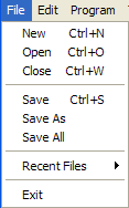
Function CreateMenu:TGadget( Text$,tag,parent:TGadget,hotkey=0,modifier=0 )
Creates a new menu item.
Menu gadgets should be attached to either a WindowMenu, other Menu gadgets or used with the PopupWindowMenu command. The tag field should be a unique identifier that will be present in the EventData field of EVENT_MENUACTION events.
Keyboard shortcuts can be associated with a Menu by using the optional hotKey and modifier parameters.
Please refer to the key codes module for valid key and modifier codes. The MODIFIER_COMMAND value should be used instead of MODIFIER_CONTROL with Menu hotkeys for best crossplatform compatability.
Menus now also support icons on most platforms through the use of SetGadgetPixmap.
See Also: FreeMenu, SetMenuText, CheckMenu, UncheckMenu, EnableMenu, DisableMenu, MenuText, MenuChecked, MenuEnabled and SetGadgetPixmap.
Example
' createmenu.bmx

Import MaxGui.Drivers

Strict

Local window:TGadget
Local filemenu:TGadget
Local editmenu:TGadget
Local helpmenu:TGadget

Const MENU_NEW=101
Const MENU_OPEN=102
Const MENU_SAVE=103
Const MENU_CLOSE=104
Const MENU_EXIT=105

Const MENU_CUT=106
Const MENU_COPY=107
Const MENU_PASTE=108

Const MENU_ABOUT=109

window=CreateWindow("My Window",40,40,320,240)

filemenu=CreateMenu("&File",0,WindowMenu(window))
CreateMenu"&New",MENU_NEW,filemenu,KEY_N,MODIFIER_COMMAND
CreateMenu"&Open",MENU_OPEN,filemenu,KEY_O,MODIFIER_COMMAND
CreateMenu"&Close",MENU_CLOSE,filemenu,KEY_W,MODIFIER_COMMAND
CreateMenu"",0,filemenu
CreateMenu"&Save",MENU_SAVE,filemenu,KEY_S,MODIFIER_COMMAND
Local saves:TGadget = CreateMenu("Save More",0,filemenu)
CreateMenu"",0,filemenu
CreateMenu"E&xit",MENU_EXIT,filemenu,KEY_F4,MODIFIER_COMMAND

editmenu=CreateMenu("&Edit",0,WindowMenu(window))
CreateMenu "Cu&t",MENU_CUT,editmenu,KEY_X,MODIFIER_COMMAND
CreateMenu "&Copy",MENU_COPY,editmenu,KEY_C,MODIFIER_COMMAND
CreateMenu "&Paste",MENU_PASTE,editmenu,KEY_V,MODIFIER_COMMAND

helpmenu=CreateMenu("&Help",0,WindowMenu(window))
CreateMenu "&About",MENU_ABOUT,helpmenu

CreateMenu("Option 1", 110,saves)
Local opt:TGadget = CreateMenu("Option 2", 111,saves)

UpdateWindowMenu window

While True
    WaitEvent
    Select EventID()
        Case EVENT_WINDOWCLOSE
            End
        Case EVENT_MENUACTION
            Select EventData()
                Case MENU_EXIT
                    End
                Case MENU_ABOUT
                    Notify "Incrediabler~n(C)2005 Incredible Software"
                Case 111
                    CheckMenu(opt)
            End Select
    End Select
Wend
Function FreeMenu( menu:TGadget )
Remove a menu.
This function has been superseded by FreeGadget, but is available for backwards compatability.
Function SetMenuText( menu:TGadget,Text$ )
Modify a menu's text.
This function has been superseded by SetGadgetText, but is available for backwards compatability.
Function CheckMenu( menu:TGadget )
Set a menu's checked state.
UpdateWindowMenu should be called where appropriate after changing a menu's state for the changes to become visible.
Function UncheckMenu( menu:TGadget )
Clear a menu's checked state.
UpdateWindowMenu should be called where appropriate after changing a menu's state for the changes to become visible.
Function EnableMenu( menu:TGadget )
Enable a menu for selection.
UpdateWindowMenu should be called where appropriate after changing a menu's status for the changes to become visible.
Function DisableMenu( menu:TGadget )
Disable a menu so it cannot be selected.
UpdateWindowMenu should be called where appropriate after changing a menu's status for the changes to become visible.
Function MenuText$( menu:TGadget )
Return a menu's text.
This function has been superseded by GadgetText, but is available for backwards compatability.
Function MenuChecked( menu:TGadget )
Return a menu's checked state.
Function MenuEnabled( menu:TGadget )
Return a menu's enabled state.
Function Desktop:TGadget()
Return a gadget representing the system's desktop.
This is particularly useful for finding the resolution of the desktop using GadgetWidth / ClientWidth or GadgetHeight / ClientHeight.
Function CreateWindow:TGadget( titletext$,x,y,w,h,group:TGadget=Null,style=WINDOW_DEFAULT )
Create a Window gadget.
A Window is the primary gadget of MaxGUI. Windows should be used as the primary group gadgets in MaxGUI applications to contain the gadgets that make up the program's user interface.
The following style flags are supported when creating a Window. Any of the style flags can be combined using the bitwise operator '|'.
| Style | Meaning |
| WINDOW_TITLEBAR | The Window has a titlebar that displays the titletext$. |
| WINDOW_RESIZABLE | The Window can be resized by the user. |
| WINDOW_MENU | The Window has an associated window menu (retrieve menu handle using [WindowMenu](../../maxgui/maxgui.maxgui/#function-windowmenutgadget-windowtgadget-)). |
| WINDOW_STATUS | The Window has a statusbar. |
| WINDOW_TOOL | A window style commonly used for toolbars and other tool windows. |
| WINDOW_CLIENTCOORDS | The dimensions specified relate to the client area as opposed to the window frame. |
| WINDOW_CENTER | The x and y parameters are ignored, and the Window is positioned either in the middle of the screen or the middle of the parent gadget. |
| WINDOW_HIDDEN | The Window is created in a hidden state and can be revealed later using [ShowGadget](../../maxgui/maxgui.maxgui/#function-showgadget-gadgettgadget-). |
| WINDOW_ACCEPTFILES | Enable file drag and drop operations (emits the EVENT_WINDOWACCEPT events). |
Note: For cross-platform projects, it is highly recommended that the WINDOW_CLIENTCOORDS style is used to maintain similar layouts with different operating systems and window managers.
The default window style (WINDOW_DEFAULT) is equivalent to WINDOW_TITLEBAR | WINDOW_RESIZABLE | WINDOW_MENU | WINDOW_STATUS.
A Window emits the following events:
| Event ID | Description |
| EVENT_WINDOWMOVE | Window has been moved. |
| EVENT_WINDOWSIZE | Window has been resized. |
| EVENT_WINDOWCLOSE | Window close icon clicked. |
| EVENT_WINDOWACTIVATE | Window has been activated. |
| EVENT_WINDOWACCEPT | A file was dropped onto a Window with the WINDOW_ACCEPTFILES style. The event Extra object holds the filepath. |
See Also: WindowMenu, UpdateWindowMenu, PopupWindowMenu, ActivateWindow, SetStatusText, WindowStatusText, SetMinWindowSize, SetMaxWindowSize, MinimizeWindow, MaximizeWindow, RestoreWindow, WindowMinimized and WindowMaximized.
Example
' createwindow.bmx

Import MaxGui.Drivers

Strict

AppTitle = "CreateWindow() Example"

Global FLAGS:Int

' Comment/uncomment any of the following lines to experiment with the different styles.

FLAGS:| WINDOW_TITLEBAR
FLAGS:| WINDOW_RESIZABLE
'FLAGS:| WINDOW_MENU
FLAGS:| WINDOW_STATUS
FLAGS:| WINDOW_CLIENTCOORDS
'FLAGS:| WINDOW_HIDDEN
FLAGS:| WINDOW_ACCEPTFILES
'FLAGS:| WINDOW_TOOL
'FLAGS:| WINDOW_CENTER

Local window:TGadget = CreateWindow( AppTitle, 100, 100, 320, 240, Null, FLAGS )

If (FLAGS & WINDOW_STATUS) Then
    SetStatusText( window, "Left aligned~tCenter aligned~tRight aligned" )
EndIf

Repeat
    WaitEvent()
    Print CurrentEvent.ToString()
    Select EventID()
        Case EVENT_APPTERMINATE, EVENT_WINDOWCLOSE
            Print "end"
            End
        Case EVENT_APPSUSPEND, EVENT_APPRESUME
            Print "suspend/resume"
    End Select
Forever
Function WindowMenu:TGadget( window:TGadget )
Returns a window's main-menu handle.
Required when a root menu is to be added to a window using CreateMenu. This function should not be used for sub-menus - the sub-menu should be parented directly to its parent menu.
It should also be mentioned that this function isn't required when creating popup menus - Null should instead be passed as the parent of the root menu.
To avoid any unexpected behavior, make sure that the window specified was created with the WINDOW_MENU style flag.
See Also: CreateMenu and UpdateWindowMenu
Function UpdateWindowMenu( window:TGadget )
Update a window's menu hierachy.
Required after changing a window's menu properties/structure for the changes to become visible.
To avoid any unexpected behavior, make sure that the window specified was created with the WINDOW_MENU style flag.
See Also: WindowMenu and CreateMenu
Function PopupWindowMenu( window:TGadget,menu:TGadget,extra:Object=Null )
Display a popup menu.
A popup context-menu is displayed on the screen at the user's current mouse position. See Also: CreateMenu
Example
Strict

Import MaxGui.Drivers

Local menu:TGadget
Local window:TGadget
Local panel:TGadget

menu=CreateMenu("popup",0,Null)
CreateMenu("Load",101,menu)
CreateMenu("Save",102,menu)

window=CreateWindow("Test PopupWindowMenu",20,20,200,200)

' create a panel to capture some mouse events

panel=CreatePanel(0,0,ClientWidth(window),ClientHeight(window),window,PANEL_ACTIVE)

While True
    WaitEvent
    Select EventID()
        Case EVENT_MOUSEDOWN
            If EventData()=2 PopupWindowMenu window,menu
        Case EVENT_WINDOWCLOSE
            End
        Case EVENT_MENUACTION
            Print "EVENT_MENUACTION: eventdata()="+EventData()
    End Select
Wend
Function ActivateWindow( window:TGadget )
Activate a window gadget.
This function has been superseded by ActivateGadget, but is available for backwards compatability.
Function WindowStatusText$( window:TGadget )
Retrieve a window's status-bar text.
Can only be used with windows created with the WINDOW_STATUS flag (see CreateWindow). Tab characters delimit between the three alignments of text. See SetStatusText for more information.
Function SetStatusText( window:TGadget,Text$ )
Set a window's status bar text.
Can only be used with windows created with the WINDOW_STATUS flag (see CreateWindow). Use tab characters to delimit between the three alignments of text. For example:
SetStatusText( window, "Left Aligned Only" )
SetStatusText( window, "Left Aligned~tCenter Aligned~tRight Aligned" )
SetStatusText( window, "~tCenter Aligned Only" )
SetStatusText( window, "~t~tRight Aligned Only" )
See Also: WindowStatusText
Function SetMinWindowSize( window:TGadget,w,h )
Set a window's minimum size.
Only useful for resizable windows (i.e. windows created with the WINDOW_RESIZABLE flag, see CreateWindow).
Function SetMaxWindowSize( window:TGadget,w,h )
Set a window's maximum size.
Only useful for resizable windows (i.e. windows created with the WINDOW_RESIZABLE flag, see CreateWindow).
Calling this function will disable the Maximize button window hint on Windows, and will limit the window zoom size on Mac OS X.
Function MinimizeWindow( window:TGadget )
Minimize a window.
A minimized window can be restored by the user to its previous state, typically by clicking on the icon representation of the window in the taskbar or dock. The same effect can be obtained programatically by calling RestoreWindow.
See Also: WindowMinimized.
Function MaximizeWindow( window:TGadget )
Maximize a window.
Maximizing a window makes the window visible and sizes it to fill the current desktop. RestoreWindow can be used to programatically restore a window to its previous unmaximized state, although the window will still remain unhidden.
See Also: WindowMaximized.
Function RestoreWindow( window:TGadget )
Restore a window from a minimized or maximized state.
See Also: MinimizeWindow and MaximizeWindow.
Function WindowMinimized( window:TGadget )
Detect if a window is minimized.
Returns
True if the window is currently minimized, False if not.
Function WindowMaximized( window:TGadget )
Detect if a window is maximized.
A maximized window fills the entire desktop. A window may be maximized with the MaximizeWindow command or by the user if CreateWindow was called with the WINDOW_RESIZABLE flag.
Returns
True if the window is currently maximized, False if not.
Function CreateButton:TGadget(label$,x,y,w,h,group:TGadget,style=BUTTON_PUSH)
Create a Button gadget.
A Button generates an EVENT_GADGETACTION TEvent whenever it is pushed.
| Style | Meaning |
| BUTTON_PUSH | Standard push button. |
| BUTTON_CHECKBOX | A check box button that displays a tick when its state is [True](../../brl/brl.blitz/#true). |
| BUTTON_RADIO | A radio button is accompanied by a small circular indicator, filled when its state is [True](../../brl/brl.blitz/#true). |
| BUTTON_OK | Standard push button that is also activated when the user presses the RETURN key. |
| BUTTON_CANCEL | Standard push button that is also activated when the user presses the ESCAPE key. |
On certain platforms, the BUTTON_PUSH flag can be combined with either BUTTON_CHECKBOX or BUTTON_RADIO to obtain a button looking similar to standard push-buttons, but mimicking the behaviour of the checkbox or radio button.
See Also: SetGadgetText, SetButtonState, ButtonState and SetGadgetPixmap.
Example
' createbutton.bmx

Import MaxGui.Drivers

Strict

Global window:TGadget = CreateWindow("MaxGUI Buttons",40,40,400,330,Null,WINDOW_TITLEBAR|WINDOW_CLIENTCOORDS)
    CreateButton("Std. Button",10,10,120,30,window,BUTTON_PUSH)
    CreateButton("OK Button",140,10,120,30,window,BUTTON_OK)
    CreateButton("Cancel Button",270,10,120,30,window,BUTTON_CANCEL)

Global panel:TGadget[4]
    panel[0]=CreatePanel(10,50,380,60,window,PANEL_GROUP,"Checkbox")
        FillPanelWithButtons(panel[0], BUTTON_CHECKBOX, "Checkbox")
    panel[1]=CreatePanel(10,120,380,60,window,PANEL_GROUP,"Checkbox (with Push Button Style)")
        FillPanelWithButtons(panel[1], BUTTON_CHECKBOX|BUTTON_PUSH, "Toggle")
    panel[2]=CreatePanel(10,190,380,60,window,PANEL_GROUP,"Radio Buttons")
        FillPanelWithButtons(panel[2], BUTTON_RADIO, "Option ")
    panel[3]=CreatePanel(10,260,380,60,window,PANEL_GROUP,"Radio Buttons (with Push Button Style)")
        FillPanelWithButtons(panel[3], BUTTON_RADIO|BUTTON_PUSH, "Option")

Repeat
    Select WaitEvent()
        Case EVENT_WINDOWCLOSE, EVENT_APPTERMINATE
            End
        Case EVENT_GADGETACTION
            Print "EVENT_GADGETACTION~n" + ..
            "GadgetText(): ~q" + GadgetText(TGadget(EventSource())) + "~q ~t " + ..
            "ButtonState(): "+ ButtonState(TGadget(EventSource()))
    EndSelect
Forever

Function FillPanelWithButtons( pPanel:TGadget, pStyle%, pText$ = "Button" )
    Local buttonwidth% = (pPanel.width-10)/3
    For Local i% = 0 Until 3
        CreateButton( pText + " " + (i+1), 5+(i*buttonwidth), 5, buttonwidth-10, 26, pPanel, pStyle )
    Next
EndFunction
Function SetButtonState( button:TGadget,checked )
Set a button's state.
Buttons created with the BUTTON_CHECKBOX and BUTTON_RADIO styles are able to show a selected state. In addition, the BUTTON_CHECKBOX style may also be able to distinguish an indeterminate state from that of a checked state through the use of the CHECK_INDETERMINATE (-1) constant, depending on the platform.
See Also: CreateButton, SetGadgetText, ButtonState and SetGadgetPixmap.
Function ButtonState( button:TGadget )
Retrieve a button's state.
Returns a non-zero value if a checkbox or radio button is selected or false if it isn't. On certain platforms, if a checkbox is set using SetButtonState to have an indeterminant state (CHECK_INDETERMINATE), then this function will return CHECK_INDETERMINATE too. See Also: CreateButton, SetGadgetText, SetButtonState and SetGadgetPixmap.
Function CreatePanel:TGadget(x,y,w,h,group:TGadget,style=0,title$="")
Create a Panel gadget.
A Panel is a general purpose gadget that can be used to group other gadgets.
Background colours and images can be set using SetGadgetColor and SetPanelPixmap.
A panel can be created with any one of the following optional styles:
| Style | Meaning |
| PANEL_SUNKEN | Panel is drawn with a sunken border (or just a simple border on OS X). |
| PANEL_RAISED | Panel is drawn with a raised border (or just a simple border on OS X). |
| PANEL_GROUP | Panel is drawn with a titled etched border. |
The PANEL_ACTIVE flag can be combined with any other style flags, or specified on its own, to generate mouse and key events (equivalent to calling SetGadgetSensitivity immediately after creation):
| Event ID | Description |
| EVENT_MOUSEDOWN | Mouse button pressed. Event data contains mouse button code. |
| EVENT_MOUSEUP | Mouse button released. Event data contains mouse button code. |
| EVENT_MOUSEMOVE | Mouse moved. Event x and y contain mouse coordinates. |
| EVENT_MOUSEWHEEL | Mouse wheel spun. Event data contains delta clicks. |
| EVENT_MOUSEENTER | Mouse entered gadget area. |
| EVENT_MOUSELEAVE | Mouse left gadget area. |
| EVENT_KEYDOWN | Key pressed. Event data contains keycode. |
| EVENT_KEYUP | Key released. Event data contains keycode. |
| EVENT_KEYCHAR | Key character. Event data contains unicode value. |
Note: The PANEL_SUNKEN / PANEL_RAISED style flags cannot be used with PANEL_GROUP.
See Also: SetPanelColor and SetPanelPixmap.
Example
' createpanel.bmx

Strict

Import MaxGui.Drivers

AppTitle = "Panel Example"

Local window:TGadget = CreateWindow( AppTitle, 100, 100, 440, 240, Null, WINDOW_TITLEBAR|WINDOW_CLIENTCOORDS|WINDOW_RESIZABLE )

' create an active panel that occupies entire window client area

Local panel:TGadget = CreatePanel(0,0,ClientWidth(window),ClientHeight(window),window,PANEL_ACTIVE)
SetGadgetLayout panel, EDGE_ALIGNED, EDGE_ALIGNED, EDGE_ALIGNED, EDGE_ALIGNED

' and add to it a smaller green panel with a sunken edge

Local panel2:TGadget = CreatePanel(10,10,200,200,panel,PANEL_ACTIVE|PANEL_SUNKEN)
SetGadgetColor(panel2,160,255,160)

' and finally a group panel with a child button

Local group:TGadget = CreatePanel(220,10,200,200,panel,PANEL_GROUP,"Group Label")
Local button:TGadget = CreateButton("Push Button",0,10,ClientWidth(group)-20,26,group)


Repeat
    WaitEvent()
    Print CurrentEvent.ToString()
    Select EventID()
        Case EVENT_WINDOWCLOSE, EVENT_APPTERMINATE
            End
    End Select
Forever
Function SetPanelColor( panel:TGadget,r,g,b )
Set the color of a Panel.
This function has been superseded by SetGadgetColor, but is available for backwards compatability. See Also: CreatePanel and SetPanelPixmap
Function SetPanelPixmap( panel:TGadget,pixmap:TPixmap,flags=PANELPIXMAP_TILE)
Set panel's background image to a pixmap.
This function has been superseded by SetGadgetPixmap, but is available for backwards compatability.
| Flags | Description |
| PANELPIXMAP_TILE | The panel is filled with repeating tiles. |
| PANELPIXMAP_CENTER | The pixmap is positioned at the center of the panel. |
| PANELPIXMAP_FIT | The pixmap is scaled to best fit the panel size. |
| PANELPIXMAP_FIT2 | A variant of PANELPIXMAP_FIT where clipping can occur to achieve a better fit. |
| PANELPIXMAP_STRETCH | The pixmap is stretched to fit the entire panel. |
The function can be passed 'Null' as the parameter for pixmap, in which case the pixmap should be removed.
See Also: CreatePanel and SetPanelColor
Function CreateTextField:TGadget(x,y,w,h,group:TGadget,style=0)
Create a TextField gadget.
A TextField is a single line text entry gadget and currently has only one style flag:
| Flags | Description |
| TEXTFIELD_PASSWORD | Masks characters being typed as a string as asterisks. |
Irrespective of the flag used, the TextField gadget will emit the following event(s):
| Event ID | Description |
| EVENT_GADGETACTION | The user has edited the text in the TextField. |
It is also possible to validate any typed input before it reaches the TextArea using the SetGadgetFilter command.
See Also: GadgetText, SetGadgetText, SetGadgetFilter.
Example
' createtextfield.bmx

Import MaxGui.Drivers

Strict

Local window:TGadget
Local textfield:TGadget
Local button:TGadget

window=CreateWindow("My Window",30,20,320,200)

textfield=CreateTextField(4,4,120,22,window)
SetGadgetText( textfield,"A textfield gadget" )

' we need an OK button to catch return key

button=CreateButton("OK",130,4,80,24,window,BUTTON_OK)

ActivateGadget textfield

While WaitEvent()
    Print CurrentEvent.ToString()
    Select EventID()
    Case EVENT_GADGETACTION
        Select EventSource()
            Case textfield
                Print "textfield updated"
            Case button
                Print "return key / OK button pressed"
        End Select
    Case EVENT_WINDOWCLOSE
        End
    End Select
Wend
Function TextFieldText$( textfield:TGadget )
Get the current text in a TextField gadget.
This function has been superseded by GadgetText, but is available for backwards compatability. See Also: CreateTextField and SetGadgetText
Function CreateTextArea:TGadget(x,y,w,h,group:TGadget,style=0)
Create a TextArea gadget.
A TextArea gadget is a multiline text editor with commands that allow control over the contents, style and selection of the text it contains.
A TextArea gadget may have the following optional styles:
| Style | Meaning |
| TEXTAREA_WORDWRAP | Long lines of text 'wrap round' onto the next lines. |
| TEXTAREA_READONLY | The text cannot be edited by the user. |
A TextArea gadget can generate the following events:
| Event ID | Description |
| EVENT_GADGETACTION | The user has modified the text in a TextArea. |
| EVENT_GADGETSELECT | The text-cursor has moved or a selection of text is made by the user. |
| EVENT_GADGETMENU | The user has right-clicked somewhere in the TextArea. |
It is also possible to validate any typed input before it reaches the TextArea using the SetGadgetFilter command.
See Also: SetTextAreaText, AddTextAreaText, TextAreaText, TextAreaLen, LockTextArea, UnlockTextArea, SetTextAreaTabs, SetGadgetFont, SetGadgetColor, TextAreaCursor, TextAreaSelLen, FormatTextAreaText, SelectTextAreaText, TextAreaChar, TextAreaLine, TextAreaCharX and TextAreaCharY.
Example
' createtextarea.bmx

Import MaxGui.Drivers
Import maxgui.maxguitextareascintilla

Strict

Global window:TGadget = CreateWindow( "My Window", 130, 20, 400, 400 )

Global textarea:TGadget = CreateTextArea( 0, 0, ClientWidth(window), ClientHeight(window), window )
    SetGadgetLayout( textarea, EDGE_ALIGNED, EDGE_ALIGNED, EDGE_ALIGNED, EDGE_ALIGNED )
    SetGadgetText( textarea, "A TextArea gadget. :-)~n~nOne line...~n...and then another!")
    ActivateGadget( textarea )

' Select the entire third (index: 2 [base-0]) line.
SelectTextAreaText( textarea, 2, 1, TEXTAREA_LINES )

' Output the properties of the current text selection (should be 1, 1 as set above).
Print "TextAreaCursor(): " + TextAreaCursor( textarea, TEXTAREA_LINES )
Print "TextAreaSelLen(): " + TextAreaSelLen( textarea, TEXTAREA_LINES )

While WaitEvent()
    Print CurrentEvent.ToString()
    Print "TextAreaSelLen(): " + TextAreaSelLen( textarea, TEXTAREA_LINES )
    Select EventID()
        Case EVENT_WINDOWCLOSE
            End
        Case EVENT_APPTERMINATE
            End
    End Select
Wend
Function SetTextAreaText( textarea:TGadget,Text$,pos=0,length=TEXTAREA_ALL,units=TEXTAREA_CHARS )
Set the contents of a TextArea gadget.
See Also: CreateTextArea, AddTextAreaText and SetGadgetText
Function AddTextAreaText( textarea:TGadget,Text$ )
Append text to the contents of a TextArea gadget.
See Also: CreateTextArea, SetTextAreaText and SetGadgetText
Function TextAreaText$( textarea:TGadget,pos=0,length=TEXTAREA_ALL,units=TEXTAREA_CHARS )
Get the contents of a TextArea gadget.
See Also: CreateTextArea, AddTextAreaText, SetTextAreaText and SetGadgetText
Function TextAreaLen( textarea:TGadget,units=TEXTAREA_CHARS )
Get the number of characters in a TextArea gadget.
See Also: CreateTextArea
Function LockTextArea( textarea:TGadget )
Lock a TextArea gadget for improved performance when formatting.
See Also: UnlockTextArea and CreateTextArea
Function UnlockTextArea( textarea:TGadget )
Unlock a previously locked TextArea gadget.
See Also: LockTextArea and CreateTextArea
Function SetTextAreaTabs( textarea:TGadget,tabwidth )
Set the tab stops of a TextArea gadget measured in pixels.
See Also: CreateTextArea
Function SetMargins( textarea:TGadget,leftmargin )
Set left margin of a TextArea measured in pixels.
See Also: CreateTextArea and SetTextAreaTabs
Function SetTextAreaFont( textarea:TGadget,font:TGuiFont )
Set the font of a TextArea gadget.
This function has been superseded by SetGadgetFont, but is available for backwards compatability. See Also: CreateTextArea
Function SetTextAreaColor( textarea:TGadget,r,g,b,bg=False )
Set the background or foreground colors of a TextArea gadget.
This function has been superseded by SetGadgetColor, but is available for backwards compatability. See Also: CreateTextArea
Function TextAreaCursor( textarea:TGadget,units=TEXTAREA_CHARS )
Find the position of the cursor in a TextArea gadget.
Use the default TEXTAREA_CHARS units argument to find out which character (column) in the line the cursor is on and use TEXTAREA_LINES to find out which line (row) the cursor is on.
See Also: TextAreaSelLen and CreateTextArea
Function TextAreaSelLen( textarea:TGadget,units=TEXTAREA_CHARS )
Find the size of the selected text in a TextArea gadget.
The TEXTAREA_CHARS option returns the number of characters currently highlighted by the user where as TEXTAREA_LINES will specify the function returns the number of lines selected.
See Also: TextAreaCursor and CreateTextArea
Function FormatTextAreaText( textarea:TGadget,r,g,b,flags,pos=0,length=TEXTAREA_ALL,units=TEXTAREA_CHARS )
Format the color and style of some text in a TextArea gadget.
The r, g and b parameters represent the red, green and blue components (0..255) which, when combined, represent the new text color for the the sepecified region of characters.
The flags parameter can be a combination of the following values:
| Constant | Meaning |
| TEXTFORMAT_BOLD | Bold |
| TEXTFORMAT_ITALIC | Italic |
| TEXTFORMAT_UNDERLINE | Underline |
| TEXTFORMAT_STRIKETHROUGH | StrikeThrough |
Depending on the value of the units parameter the position and length parameters specify the character position and number of characters or the starting line and the number of lines that FormatTextAreaText will modify.
See Also: LockTextArea and CreateTextArea
Function SelectTextAreaText( textarea:TGadget,pos=0,length=TEXTAREA_ALL,units=TEXTAREA_CHARS )
Select a range of text in a TextArea gadget.
Depending on the value of the units the position and length parameters specify the character position and number of characters or the starting line and the number of lines that SelextTextAreaText will highlight.
See Also: TextAreaCursor, TextAreaSelLen and CreateTextArea
Function TextAreaChar( textarea:TGadget,Line )
Find the character position of a given line in a TextArea gadget.
Function TextAreaLine( textarea:TGadget,index )
Find the line of a given character position in a TextArea gadget.
Function TextAreaCharX( textarea:TGadget, char )
Find the x-coordinate of a textarea character position, relative to the upper left corner of the gadget.
The returned value may be greater than the width of the gadget (or even negative) if the specified character index is positioned outside the immediately visible area of a scrollable TextArea.
Function TextAreaCharY( textarea:TGadget, char )
Find the y-coordinate of a textarea character position, relative to the upper left corner of the gadget.
The returned value may be greater than the height of the gadget (or even negative) if the specified character index is positioned outside the immediately visible area of a scrollable TextArea.
Function SetTextAreaCaretWidth( textarea:TGadget, width:Int )
Sets the caret width in a TextArea gadget.
Function SetTextAreaCaretColor( textarea:TGadget, r:Int, g:Int, b:Int )
Sets the caret color in a TextArea gadget.
Function TextAreaHasUndoRedo:Int(textarea:TGadget)
The TextArea gadget provides its own Undo/Redo facility.
Function TextAreaEnableUndoRedo(textarea:TGadget, enable:Int)
Enables or disables undo/redo actions for the specified TextArea gadget.
Function TextAreaUndoRedoEnabled:Int(textarea:TGadget)
Returns whether undo/redo actions for the specified TextArea gadget are enabled.
Function TextAreaUndo(textarea:TGadget)
Performs an undo action for the given TextArea gadget.
Function TextAreaRedo(textarea:TGadget)
Performs a redo action for the given TextArea gadget.
Function TextAreaCanUndo:Int(textarea:TGadget)
Returns True if the TextArea can perform an undo action.
Function TextAreaCanRedo:Int(textarea:TGadget)
Returns True if the TextArea can perform a redo action.
Function TextAreaClearUndoRedo(textarea:TGadget)
Clears any cached undo/redo actions for the TextArea.
Function CreateComboBox:TGadget(x,y,w,h,group:TGadget,style=0)
Create a ComboBox gadget.
A ComboBox gadget provides a dropdown list of items to the user.
The ComboBox supports the following styles:
| Style | Meaning |
| COMBOBOX_EDITABLE | Allows the ComboBox to behave similar to a TextField, by allowing typed user input also. |
And emits the following events:
| Event ID | Description |
| EVENT_GADGETACTION | The selection has been cleared, or the text has changed. |
See Also: AddGadgetItem, ClearGadgetItems, ModifyGadgetItem, SelectGadgetItem, RemoveGadgetItem, SelectedGadgetItem and SetGadgetIconStrip.
Example
' createcombobox.bmx
Strict
Import MaxGui.Drivers
AppTitle = "ComboBox Style Example"
Global window:TGadget = CreateWindow( AppTitle, 100, 100, 300, 200, Null, WINDOW_TITLEBAR|WINDOW_STATUS )
CreateLabel( "No Style (0): ", 5, 5, ClientWidth(window)-10, 24, window, LABEL_LEFT )
Global stdComboBox:TGadget = CreateComboBox( 5, 29, ClientWidth(window)-10, 26, window, 0 )
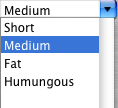
AddGadgetItem stdComboBox, "Short"
AddGadgetItem stdComboBox, "Medium"
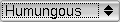
AddGadgetItem stdComboBox, "Fat", True
AddGadgetItem stdComboBox, "Humungous"
CreateLabel( "COMBOBOX_EDITABLE: ", 5, 59, ClientWidth(window)-10, 24, window, LABEL_LEFT )
Global editcombobox:TGadget = CreateComboBox( 5, 83, ClientWidth(window)-10, 26, window, COMBOBOX_EDITABLE )
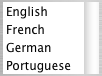
AddGadgetItem editcombobox, "United Kingdom"
AddGadgetItem editcombobox, "United States", True
Local tmpText$
Repeat
WaitEvent()
Print CurrentEvent.ToString()
Select EventID()
'Combobox Event(s)
'EventData() holds the index of the selected item (or -1 if no item is currently selected)
Case EVENT_GADGETACTION
Select EventSource()
Case stdComboBox
tmpText = ""
If EventData() > -1 Then
tmpText = GadgetItemText(TGadget(EventSource()), EventData())
EndIf
SetStatusText window, "Weight chosen: " + tmpText
Case editComboBox
tmpText = ""
If EventData() > -1 Then
tmpText = GadgetItemText(TGadget(EventSource()), EventData())
Else
tmpText = GadgetText(TGadget(EventSource())) + " [user text]"
EndIf
SetStatusText window, "Country chosen: " + tmpText
EndSelect
Case EVENT_WINDOWCLOSE, EVENT_APPTERMINATE
End
EndSelect
Forever
Function CreateListBox:TGadget(x,y,w,h,group:TGadget,style=0)
Create a ListBox gadget.
A ListBox gadget displays a scrollable list of items and generates the following events:
| Event ID | Description |
| EVENT_GADGETSELECT | An item has been selected, or the selection has been cleared. |
| EVENT_GADGETACTION | An item has been double-clicked. |
| EVENT_GADGETMENU | The user has right-clicked somewhere in the listbox. |
See Also: AddGadgetItem, ClearGadgetItems, ModifyGadgetItem, SelectGadgetItem, RemoveGadgetItem, SelectedGadgetItem, SelectedGadgetItems and SetGadgetIconStrip.
Example
' createlistbox.bmx

Strict

Import MaxGui.Drivers

AppTitle = "ListBox Example"

Global window:TGadget = CreateWindow( AppTitle, 100, 100, 200, 200, Null, WINDOW_TITLEBAR|WINDOW_STATUS|WINDOW_RESIZABLE )

    Global listbox:TGadget = CreateListBox( 0, 0, ClientWidth(window), ClientHeight(window), window )
    SetGadgetLayout listbox, EDGE_ALIGNED, EDGE_ALIGNED, EDGE_ALIGNED, EDGE_ALIGNED

    SetGadgetIconStrip listbox, LoadIconStrip("toolbar.png")
    AddGadgetItem listbox, "New", False, 0, "Create something."
    AddGadgetItem listbox, "Open", False, 1, "Open something."
    AddGadgetItem listbox, "Save", False, 2, "Save something.", "Extra Item Object!"
    AddGadgetItem listbox, "No Icon", False, -1, "This should not have an icon set."


SelectGadgetItem listbox, 2

While WaitEvent()
    Print CurrentEvent.ToString()
    Select EventID()
        Case EVENT_WINDOWCLOSE, EVENT_APPTERMINATE;End
        'ListBox Event(s)
        'EventData() holds the index of the corresponding listbox item.
        Case EVENT_GADGETSELECT
            SetStatusText window, "Selected Item Index: " + EventData()
        Case EVENT_GADGETACTION
            SetStatusText window, "Double-Clicked Item Index: " + EventData()
        Case EVENT_GADGETMENU
            SetStatusText window, "Right-Clicked Item Index: " + EventData()
    End Select
Wend
Function CreateTabber:TGadget(x,y,w,h,group:TGadget,style=0)
Create a Tabber gadget.
A Tabber gadget shows a list of tabs above a client area, typically used for handling multiple documents/panels.
| Event ID | Description |
| EVENT_GADGETACTION | A new tab has been selected. Event data contains the tab index. |
| EVENT_GADGETMENU | A tab has been right-clicked. Event data contains the tab index. |
Event extra for both events point to the GadgetItemExtra object set for the corresponding tab item index in the latest call to AddGadgetItem / InsertGadgetItem or ModifyGadgetItem.
It is important to note also that, similar to SelectedGadgetItem, either event may be emitted with the event data set to '-1'. This either means that somehow the user has deselected a tab, or that the user has right-clicked on an area of the tabber which doesn't represent a particular tab item index. As such, your MaxGUI applications should check the value before proceeding to use it with any of the standard GadgetItemText, GadgetItemExtra etc. commands.
See Also: AddGadgetItem, ClearGadgetItems, ModifyGadgetItem, SelectGadgetItem, RemoveGadgetItem, SelectedGadgetItem and SetGadgetIconStrip.
Example
' createtabber.bmx

Import MaxGui.Drivers

Strict

Local window:TGadget
Local tabber:TGadget
Local document:TGadget[3]
Local currentdocument:TGadget

' CreateDocument creates a hidden panel that fills entire tabber client area

Function CreateDocument:TGadget(tabber:TGadget)
    Local   panel:TGadget
    panel=CreatePanel(0,0,ClientWidth(tabber),ClientHeight(tabber),tabber)
    SetGadgetLayout panel,1,1,1,1
    HideGadget panel
    Return panel
End Function

' create a default window with a tabber gadget that fills entire client area

window=CreateWindow("My Window",30,20,400,300)

tabber=CreateTabber(0,0,ClientWidth(window),ClientHeight(window),window)
SetGadgetLayout tabber,1,1,1,1

' add three items and corresponding document panels to the tabber

AddGadgetItem tabber,"Document 0 R",False,-1,""
AddGadgetItem tabber,"Document 1 G",False,-1,"Tabber Tip 1"
AddGadgetItem tabber,"Document 2 B",False,-1,"tips 4 2"

document[0]=CreateDocument(tabber)
document[1]=CreateDocument(tabber)
document[2]=CreateDocument(tabber)

SetPanelColor document[0],255,200,200
SetPanelColor document[1],200,255,200
SetPanelColor document[2],200,200,255

' our documents start off hidden so make first one current and show

currentdocument=document[0]
ShowGadget currentdocument

' standard message loop with special tabber EVENT_GADGETACTION and EVENT_GADGETMENU handling

While WaitEvent()
    Select EventID()
        Case EVENT_GADGETACTION
            If EventSource()=tabber
                HideGadget currentdocument
                currentdocument=document[EventData()]
                ShowGadget currentdocument
            EndIf
        Case EVENT_GADGETMENU
            If EventSource()=tabber
                Notify "You right clicked the tab with index " + EventData() + "!"
            EndIf
        Case EVENT_WINDOWCLOSE
            End
    End Select
Wend
Function ClearGadgetItems(gadget:TGadget)
Remove all items added to a list based gadget.
See Also: CreateComboBox, CreateListBox, CreateToolbar and CreateTabber
Function AddGadgetItem(gadget:TGadget,Text$,flags=0,icon=-1,tip$="",extra:Object=Null)
Add an item to a list based gadget.
An item can be added to the ComboBox, ListBox, Tabber and Toolbar list based gadgets.
Its text parameter is used as its label.
The flags parameter can be a combination of the following values:
| Flag | Meaning |
| GADGETITEM_NORMAL | A plain gadget item. |
| GADGETITEM_DEFAULT | The item defaults to a selected state. |
| GADGETITEM_TOGGLE | The item alternates between selected states when pressed. |
| GADGETITEM_LOCALIZED | The item text and tooltip are localization strings. |
The tip$ parameter attaches an optional tooltip to the item.
The optional icon parameter specifies an icon from the gadget's IconStrip (see SetGadgetIconStrip).
The extra parameter is supplied in the EventExtra field of any Event generated by the Item.
See Also: InsertGadgetItem, CreateComboBox, CreateListBox, CreateTabber, CreateToolbar and SetGadgetIconStrip.
Function InsertGadgetItem(gadget:TGadget,index,Text$,flags=0,icon=-1,tip$="",extra:Object=Null)
Inserts an item in a list based gadget at the specified index.
An item can be inserted in a ComboBox, ListBox, Tabber and Toolbar list based gadgets.
See AddGadgetItem for a description of the parameters.
See Also: CreateComboBox, CreateListBox, CreateTabber and CreateToolbar
Function ModifyGadgetItem( gadget:TGadget,index,Text$,flags=0,icon=-1,tip$="",extra:Object=Null )
Modify the properties of a gadget-item.
See AddGadgetItem for a description of the parameters.
See Also: CreateComboBox, CreateListBox, CreateTabber and CreateToolbar
Function RemoveGadgetItem( gadget:TGadget,index )
Remove a gadget-item from a list based gadget.
See Also: CreateComboBox, CreateListBox, CreateTabber and CreateToolbar
Function EnableGadgetItem( gadget:TGadget,index )
Enable a particular item in a list based gadget.
Typically, this can only be used on toolbars. See Also: CreateToolbar
Function DisableGadgetItem( gadget:TGadget,index )
Disable a particular item in a list based gadget.
Typically, this can only be used on toolbars. See Also: CreateToolbar
Function SelectGadgetItem(gadget:TGadget,index)
Select an item in a list based gadget.
See Also: DeselectGadgetItem, ToggleGadgetItem, CreateComboBox, CreateListBox, CreateToolbar and CreateTabber
Function DeselectGadgetItem(gadget:TGadget,index)
Deselect an item in a list based gadget.
See Also: SelectGadgetItem, ToggleGadgetItem, CreateComboBox, CreateListBox, CreateToolbar and CreateTabber
Function ToggleGadgetItem(gadget:TGadget,index)
Invert the selected state of an item in a list based gadget.
See Also: SelectGadgetItem, DeselectGadgetItem and CreateToolbar
Function SelectedGadgetItem(gadget:TGadget)
Get the index of the first selected item in a list based gadget.
SelectedGadgetItem will return -1 if the list based gadget has no selected items.
See Also: CreateComboBox, CreateListBox and CreateTabber
Function SelectedGadgetItems[](gadget:TGadget)
Returns an integer array of the selected item indexes in a list based gadget.
See Also: CreateComboBox, CreateListBox and CreateTabber
Function CountGadgetItems( gadget:TGadget )
Get the number of items in a list based gadget.
See Also: CreateComboBox, CreateListBox, CreateTabber and CreateToolbar
Function GadgetItemText$( gadget:TGadget,index )
Get the text of a given item in a list based gadget.
See Also: CreateComboBox, CreateListBox, CreateToolbar and CreateTabber
Function GadgetItemTooltip$( gadget:TGadget,index )
Get the tooltip of a given item in a list based gadget.
See Also: CreateComboBox, CreateListBox, CreateToolbar and CreateTabber
Function GadgetItemIcon( gadget:TGadget,index )
Get the icon of a given item in a list based gadget.
See Also: CreateComboBox, CreateListBox, CreateToolbar and CreateTabber
Function GadgetItemExtra:Object( gadget:TGadget,index )
Get the extra data of a given item in a list based gadget.
See Also: CreateComboBox, CreateListBox, CreateToolbar and CreateTabber
Function GadgetItemFlags( gadget:TGadget,index )
Get the flags parameter of a given item in a list based gadget.
See Also: AddGadgetItem
Function CreateToolBar:TGadget(source:Object,x,y,w,h,window:TGadget,style=0)
Creates a window toolbar.
A Toolbar is created from an iconstrip - an image that contains a row of equally shaped icons. Any images in the row left blank are treated as Toolbar separators.
Toolbars are positioned along the top of the window and either the client-area and/or window frame will be resized so that the client area of the window will begin just below the toolbar.
At present, MaxGUI windows only support one toolbar at a time.
A Toolbar generates the following events:
| Event ID | Description |
| EVENT_GADGETACTION | A toolbar item has been selected/clicked. Event data contains the item index. |
The source parameter can be a previously loaded TIconStrip, a TPixmap or a URL to an image file which CreateToolBar will attempt to load an icon-strip from automatically.
The recommended icon size is 24x24 pixels which seems to work well on most platforms. Using a different icon size may result in the pixmaps being scaled before being set depending on the OS.
The x, y, w, h parameters are all ignored and are simply there to make the CreateToolbar() system call consistent with the other CreateGadget() calls.
The toolbar can be alterted during runtime using the ClearGadgetItems, InsertGadgetItem, ModifyGadgetItem etc. functions. Use the GADGETICON_SEPARATOR constant as an item's icon if you want it to be a separator, or GADGETICON_BLANK if you would like a blank square icon instead.
IMPORTANT: Toolbars should only be parented to window gadgets. Parenting a toolbar to a panel is not officially supported - users are strongly advised to instead use push-buttons with pixmap icons set. Debug builds will output a warning message to standard error if toolbars are parented otherwise.
See Also: AddGadgetItem, EnableGadgetItem, DisableGadgetItem and SetToolbarTips.
Example
' createtoolbar.bmx

Strict

Import MaxGui.Drivers

AppTitle = "ToolBar Example"

Global window:TGadget = CreateWindow( AppTitle, 100, 100, 400, 32, Null, WINDOW_TITLEBAR|WINDOW_STATUS|WINDOW_RESIZABLE|WINDOW_CLIENTCOORDS )

    Global toolbar:TGadget = CreateToolBar( "toolbar.png", 0, 0, 0, 0, window )

    DisableGadgetItem toolbar, 2

    SetToolBarTips toolbar, ["New", "Open", "Save should be disabled."]

    AddGadgetItem toolbar, "", 0, GADGETICON_SEPARATOR  'Add a separator.
    AddGadgetItem toolbar, "Toggle", GADGETITEM_TOGGLE, 2, "This toggle button should change to a light bulb when clicked."

    Global button:TGadget = CreateButton( "Show/Hide Toolbar", 2, 2, 180, 28, window )
    SetGadgetLayout button, EDGE_ALIGNED, EDGE_CENTERED, EDGE_ALIGNED, EDGE_CENTERED

While WaitEvent()
    Print CurrentEvent.ToString()
    Select EventID()
        Case EVENT_WINDOWCLOSE, EVENT_APPTERMINATE;End
        'ToolBar Event(s)
        'EventData() holds the index of the toolbar item clicked.
        Case EVENT_GADGETACTION
            Select EventSource()
                Case button
                    If GadgetHidden(toolbar) Then ShowGadget(toolbar) Else HideGadget(toolbar)
                Case toolbar
                    SetStatusText window, "Toolbar Item Clicked: " + EventData()
            EndSelect
    End Select
Wend
Function SetToolBarTips( toolbar:TGadget,tips$[] )
Attach a list of tips to a Toolbar gadget.
Simply provides a quick way to set the tooltips of a toolbar's items after them being added. See Also: CreateToolbar
Function CreateTreeView:TGadget(x,y,w,h,group:TGadget,style=0)
Create a TreeView gadget.
A TreeView provides a view of an expandable list of nodes populated with the AddTreeViewNode command. TreeView nodes can themselves contain nodes providing a flexible method of displaying a hierachy of information.
| Event ID | Description |
| EVENT_GADGETSELECT | The user has selected a node. |
| EVENT_GADGETACTION | The user has double-clicked a node. |
| EVENT_GADGETOPEN | The user has expanded a node, revealing its children. |
| EVENT_GADGETCLOSE | The user has collapsed a node, hiding its children. |
| EVENT_GADGETMENU | The user has right-clicked somewhere in the TreeView. |
Each event will have the containing TreeView gadget as the event source and the concerned node gadget in the EventExtra field of the TEvent.
See Also: AddTreeViewNode, InsertTreeViewNode, ModifyTreeViewNode, TreeViewRoot, SelectedTreeViewNode and CountTreeViewNodes, SelectTreeViewNode, ExpandTreeViewNode, CollapseTreeViewNode and FreeTreeViewNode.
Example
' createtreeview.bmx

Import MaxGui.Drivers

Strict

Local window:TGadget=CreateWindow("My Window",50,50,240,240,Null,WINDOW_TITLEBAR|WINDOW_CLIENTCOORDS)
Local treeview:TGadget=CreateTreeView(5,5,ClientWidth(window)-10,ClientHeight(window)-10,window)

SetGadgetLayout treeview, EDGE_ALIGNED, EDGE_ALIGNED, EDGE_ALIGNED, EDGE_ALIGNED

Local root:TGadget=TreeViewRoot(treeview)

Local help:TGadget=AddTreeViewNode("Help",root)
AddTreeViewNode "Topic 1",help
AddTreeViewNode "Topic 2",help
AddTreeViewNode "Topic 3",help

Local projects:TGadget=AddTreeViewNode("Projects",root)
AddTreeViewNode("Sub Project",AddTreeViewNode("Project 1",projects))
AddTreeViewNode("Project 2",projects)
AddTreeViewNode("Project 3",projects)

While WaitEvent()
    Print CurrentEvent.ToString()
    Select EventID()
        Case EVENT_WINDOWCLOSE
            End
    End Select
Wend
Function AddTreeViewNode:TGadget( Text$,node:TGadget,icon=-1,extra:Object=Null )
Add a node to a TreeView gadget.
The optional extra parameter is for convenience and is equivalent to calling SetGadgetExtra immediately after the node is created.
See Also: CreateTreeView, InsertTreeViewNode
Function InsertTreeViewNode:TGadget( index,Text$,node:TGadget,icon=-1,extra:Object=Null )
Insert a node at a given index in a TreeView gadget.
The optional extra parameter is for convenience and is equivalent to calling SetGadgetExtra immediately after the node is created.
See Also: CreateTreeView, AddTreeViewNode
Function ModifyTreeViewNode( node:TGadget,Text$,icon=-1 )
Modify a node.
See Also: CreateTreeView
Function ClearTreeView( treeview:TGadget )
Frees all the nodes of a TreeView.
See Also: CreateTreeView
Function TreeViewRoot:TGadget( treeview:TGadget )
Get the root node of a TreeView gadget.
This is required to parent the first nodes of a blank treeview to.
A treeview's root node can also be used to deselect any currently selected nodes (see SelectTreeViewNode for more information).
See Also: CreateTreeView
Function SelectedTreeViewNode:TGadget( treeview:TGadget )
Get the node currently selected in a TreeView gadget.
Will return Null if there aren't any nodes currently selected.
See Also: CreateTreeView, SelectTreeViewNode
Function CountTreeViewNodes( node:TGadget )
Get the number of children of a Node gadget.
See Also: CreateTreeView
Function SelectTreeViewNode( node:TGadget )
Selects/highlights a treeview node.
It is possible to deselect a selection by selecting a treeview's root node. For example:
SelectTreeViewNode( TreeViewRoot( myTree ) )
See Also: CreateTreeView, SelectedTreeViewNode
Function ExpandTreeViewNode( node:TGadget )
Expands a treeview node in a TreeView gadget.
See Also: CreateTreeView, CollapseTreeViewNode
Function CollapseTreeViewNode( node:TGadget )
Collapses a treeview node in a TreeView gadget.
See Also: CreateTreeView, ExpandTreeViewNode
Function FreeTreeViewNode( node:TGadget )
Removes a treeview node from a TreeView gadget.
This function has been superseded by FreeGadget, but is available for backwards compatability.
See Also: CreateTreeView
Function CreateHTMLView:TGadget(x,y,w,h,group:TGadget,style=0)
Create an HTMLView gadget.
The HTMLView is a complete web browser object inside a MaxGUI gadget. The HTML page displayed is controlled with the HTMLViewGo command or from the user navigating from within the currently viewed page.
CreateHTMLView supports the following styles:
| Style | Meaning |
| HTMLVIEW_NOCONTEXTMENU | The webpage's default context menu is disabled. |
| HTMLVIEW_NONAVIGATE | User navigation is disabled and EVENT_GADGETACTION is generated instead. |
| Event ID | Description |
| EVENT_GADGETDONE | Generated when a webpage has finished loading or a page anchor has been scrolled to. |
| EVENT_GADGETACTION | Generated when a user clicks a link. Event Text contains the requested URL. |
Note: EVENT_GADGETACTION requires the HTMLVIEW_NONAVIGATE style flag.
See Also: HtmlViewGo, HtmlViewBack, HtmlViewForward, HtmlViewStatus and HtmlViewCurrentURL.
Example
' createhtmlview.bmx

Import MaxGui.Drivers

Strict

Local window:TGadget
Local htmlview:TGadget

window=CreateWindow("My Window",30,20,600,440,,15|WINDOW_ACCEPTFILES)

htmlview=CreateHTMLView(0,0,ClientWidth(window),ClientHeight(window),window)
SetGadgetLayout htmlview,1,1,1,1

HtmlViewGo htmlview,"www.blitzmax.com"

While WaitEvent()
    Print CurrentEvent.ToString()
    Select EventID()
        Case EVENT_WINDOWCLOSE
            End
    End Select
Wend
Function HtmlViewGo( view:TGadget,url$ )
Direct the HTMLView gadget to a new URL.
See Also: CreateHTMLView
Function HtmlViewBack( view:TGadget )
Go back a page in an HTMLView gadget.
See Also: CreateHTMLView
Function HtmlViewForward( view:TGadget )
Go forward a page in an HTMLView gadget.
See Also: CreateHTMLView
Function HtmlViewStatus( view:TGadget )
Get the status of an HTMLView gadget.
See Also: CreateHTMLView
Function HtmlViewCurrentURL$( view:TGadget )
Get the current URL of an HTMLView gadget.
See Also: CreateHTMLView
Function HtmlViewRun$( view:TGadget,script$ )
Run a script in an HTMLView gadget.
See Also: CreateHTMLView
Function CreateLabel:TGadget( name$,x,y,w,h,group:TGadget,style=LABEL_LEFT )
Create a Label gadget.
A Label gadget is used to place static text or frames in a MaxGUI user interface. They do not generate any events.
Labels support these optional styles:
| Style | Meaning |
| LABEL_FRAME | The label has a simple border. |
| LABEL_SUNKENFRAME | The label has a sunken border. |
| LABEL_SEPARATOR | The label is an etched box with no text useful for drawing separators. |
| LABEL_LEFT | The label's text is left-aligned. This is the default. |
| LABEL_CENTER | The label's text is center-aligned. |
| LABEL_RIGHT | The label's text is right-aligned. |
See Also: SetGadgetText, SetGadgetTextColor, SetGadgetFont and SetGadgetColor.
Example
' createlabel.bmx

Import MaxGui.Drivers

Strict

Local window:TGadget

window=CreateWindow("My Window",30,20,320,480)

CreateLabel("A plain label",10,10,280,52,window)
CreateLabel("A label with LABEL_FRAME",10,80,280,60,window,LABEL_FRAME)
CreateLabel("A label with LABEL_SUNKENFRAME",10,150,280,60,window,LABEL_SUNKENFRAME)
CreateLabel("not applicable",10,220,280,54,window,LABEL_SEPARATOR)

While WaitEvent()<>EVENT_WINDOWCLOSE
Wend
Function CreateSlider:TGadget( x,y,w,h,group:TGadget,style=0 )
Create a Slider gadget.
A Slider gadget supports the following styles:
| Style | Meaning |
| SLIDER_HORIZONTAL | The slider is moved left and right. |
| SLIDER_VERTICAL | The slider is moved up and down. |
| SLIDER_SCROLLBAR | The slider uses a proportional size knob. |
| SLIDER_TRACKBAR | The slider uses a fixed size knob. |
| SLIDER_STEPPER | The slider has no knob, just arrow buttons. |
A slider only emits one type of event:
| Event ID | Description |
| EVENT_GADGETACTION | The user has changed the slider's value. Event Data contains the SliderValue. |
See Also: SetSliderRange, SetSliderValue and SliderValue
Example
' createslider.bmx

Import MaxGui.Drivers

Strict

Local window:TGadget=CreateWindow("My Window",0,0,240,240,,WINDOW_TITLEBAR)

Local slider:TGadget[3]

' standard vertical and horizontal scroll bars

slider[0]=CreateSlider(10,10,16,100,window,SLIDER_VERTICAL)
slider[1]=CreateSlider(30,10,100,16,window,SLIDER_HORIZONTAL)

' a horizontal trackbar

slider[2]=CreateSlider(30,30,100,24,window,SLIDER_HORIZONTAL|SLIDER_TRACKBAR)

' a row of vertical trackbars

Local trackbar:TGadget[5]

For Local i=0 To 4
    trackbar[i]=CreateSlider(30+i*20,50,16,60,window,SLIDER_VERTICAL|SLIDER_TRACKBAR)
Next

' a single stepper

Local stepper:TGadget
stepper=CreateSlider(10,120,24,24,window,SLIDER_STEPPER)

SetSliderValue stepper,4
Print SliderValue(stepper)

While WaitEvent()
    Print CurrentEvent.ToString()
    Select EventID()
        Case EVENT_WINDOWCLOSE
            End
    End Select
Wend
Function SetSliderRange( slider:TGadget,range0,range1 )
Set the range of a Slider gadget.
For the default SLIDER_SCROLLBAR style the range0,range1 parameters are treated as a visible / total ratio which dictates both the size of the knob and it's maximum value. The default value is 1,10 which displays a Slider with a knob that occupies 1/10th the area and with a SliderValue range of 0..9.
For the SLIDER_TRACKBAR and SLIDER_STEPPER styles the range0,range1 parameters are treated as the minimum and maximum SliderValue range inclusive.
See Also: CreateSlider, SliderValue and SetSliderValue
Function SetSliderValue( slider:TGadget,value )
Set the position of a Slider gadget.
See Also: CreateSlider, SetSliderRange and SliderValue
Function SliderValue( slider:TGadget )
Get the position of a Slider gadget.
See Also: CreateSlider, SetSliderRange and SetSliderValue
Function CreateProgBar:TGadget( x,y,w,h,group:TGadget,style=0 )
Create a Progress Bar gadget.
Similar to Labels, Progress Bar gadgets do not generate any events themselves. See Also: UpdateProgBar
Example
' createprogbar.bmx

Import MaxGui.Drivers

Strict

Local window:TGadget=CreateWindow("My Window",50,50,240,100,,WINDOW_TITLEBAR)

Local progbar:TGadget=CreateProgBar(10,10,200,20,window)

CreateLabel "Please Wait",10,40,200,20,window

CreateTimer 10

While WaitEvent()
    Select EventID()
        Case EVENT_WINDOWCLOSE
            End
        Case EVENT_TIMERTICK
            Local t=EventData()
            If t=50 End
            UpdateProgBar progbar,t/50.0
    End Select
Wend
Function UpdateProgBar( progbar:TGadget,value# )
Update the display of a ProgressBar gadget.
See Also: CreateProgBar
Function LoadIconStrip:TIconStrip( source:Object )
Creates an icon strip from an image file.
An icon strip is a series of small images that can be attached to item-based gadgets.
Icons must be square, and arranged in a single horizontal strip across the source image.
The number of icons in an iconstrip is determined by dividing the image width by its height. For example, an iconstrip 64 wide by 8 high is assumed to contain 64/8=8 icons.
Once an icon strip has been loaded, it can be attached to item-based gadgets using SetGadgetIconStrip.
See Also: SetGadgetIconStrip and PixmapFromIconStrip
Function SetGadgetIconStrip( gadget:TGadget,iconstrip:TIconStrip )
Attaches an icon strip to an item-based gadget.
Once attached, icons can be specified when items are added or modified with the AddGadgetItem, InsertGadgetItem and ModifyGadgetItem commands.
This command may only be used with the ComboBox, ListBox, Tabber and TreeNode gadgets.
Note: It is highly recommended that icon-strips are set before any items are added to a gadget.
See Also: LoadIconStrip
Function PixmapFromIconStrip:TPixmap( iconstrip:TIconStrip, index = -1 )
Returns a pixmap containing either a copy of the original icon-strip or just the specified icon.
iconstrip: The icon-strip to return a pixmap from.
index: The index (base 0) of the icon to extract. If this is negative, a copy of the original pixmap used to create the iconstrip is returned.
This function will return Null if no iconstrip is passed, or if the icon index is invalid.
See Also: LoadIconStrip
Function CreateCanvas:TGadget( x,y,w,h,group:TGadget,style=0 )
Create a Canvas gadget.
A Canvas provides a Graphics interface for realtime drawing purposes.
Once a Canvas is created, the CanvasGraphics() Function can be used with the SetGraphics command to direct Max2D drawing commands to be drawn directly on the Canvas.
An EVENT_GADGETPAINT event is generated whenever the gadget must be redrawn by either the system (for instance when it is first shown) or due to the RedrawGadget command.
An EVENT_GADGETPAINT handler should always call SetGraphics with the canvas's Max2D graphics context to ensure the viewport and similar properties are in their correct state.
When a Canvas is active using either the ActivateGadget command or clicking on the Canvas when the application is running, the following events will also be sent from the Canvas:
| Event ID | Description |
| EVENT_MOUSEDOWN | Mouse button pressed. Event data contains mouse button code. |
| EVENT_MOUSEUP | Mouse button released. Event data contains mouse button code. |
| EVENT_MOUSEMOVE | Mouse moved. Event x and y contain mouse coordinates. |
| EVENT_MOUSEWHEEL | Mouse wheel spun. Event data contains delta clicks. |
| EVENT_MOUSEENTER | Mouse entered gadget area. |
| EVENT_MOUSELEAVE | Mouse left gadget area. |
| EVENT_KEYDOWN | Key pressed. Event data contains keycode. |
| EVENT_KEYUP | Key released. Event data contains keycode. |
| EVENT_KEYCHAR | Key character. Event data contains unicode value. |
See Also: ActivateGadget, RedrawGadget, CanvasGraphics
Example
' createcanvas.bmx

Import MaxGui.Drivers

Strict

Global GAME_WIDTH=320
Global GAME_HEIGHT=240

' create a centered window with client size GAME_WIDTH,GAME_HEIGHT

Local wx=(ClientWidth(Desktop())-GAME_WIDTH)/2
Local wy=(ClientHeight(Desktop())-GAME_HEIGHT)/2

Local window:TGadget=CreateWindow("My Canvas",wx,wy,GAME_WIDTH,GAME_HEIGHT,Null,WINDOW_TITLEBAR)'|WINDOW_CLIENTCOORDS)

' create a canvas for our game
Local canvas:TGadget=CreateCanvas(0,0,320,240,window)

' create an update timer

CreateTimer 60

While WaitEvent()
    Select EventID()
        Case EVENT_TIMERTICK
            RedrawGadget canvas

        Case EVENT_GADGETPAINT
            SetGraphics CanvasGraphics(canvas)
            SetOrigin 160,120
            SetLineWidth 5
            Cls
            Local t=MilliSecs()
            DrawLine 0,0,120*Cos(t),120*Sin(t)
            DrawLine 0,0,80*Cos(t/60),80*Sin(t/60)
            Flip

        Case EVENT_MOUSEMOVE
            Print "MOVE!"

        Case EVENT_WINDOWCLOSE
            FreeGadget canvas
            End

        Case EVENT_APPTERMINATE
            End
    End Select
Wend
Function CanvasGraphics:TGraphics( gadget:TGadget )
Retrieve a Canvas gadget's Graphics context.
The RedrawGadget example shows an alternative method for drawing to Canvas gadgets utilizing the EVENT_GADGETPAINT event.
See Also: CreateCanvas
Function QueryGadget:Byte Ptr( gadget:TGadget,queryid )
Return internal gadget handle.
QueryGadget retrieves system handles for use with API specific functions.
| Constant | Return Value |
| QUERY_HWND | A Windows API HWND handle. |
| QUERY_HWND_CLIENT | A Windows API HWND handle representing a gadget's client area. |
| QUERY_NSVIEW | A Cocoa NSView handle. |
| QUERY_NSVIEW_CLIENT | A Cocoa NSView representing a gadget's client area. |
| QUERY_FLWIDGET | An FL_WIDGET handle. |
| QUERY_FLWIDGET_CLIENT | An FL_WIDGET handle representing a gadget's client area. |
Function GadgetScaleFactor:Int( gadget:TGadget )
Returns the gadget scale factor that maps from window coordiantes to the actual device pixels.
On traditional systems this is 1, but on very high density outputs this can be a higher value (often 2).